Using this site
Terms
- Website Terms Of Use
- Marketplace Terms
- Privacy Policy
- Refund Policy
- Terms of Use for Free License
- Terms for Authors
- Terms for Partners
- Premium Support
Licenses
Guidelines
- Welcome
- Editor rights
- Common rejection reasons
- Developer guide
- Author names
- Common requirements to new products
- Developer tools
- Describing your products
- Code and functionality
- Screenshots
- Icons
- Back-end user interface
- Banner image
- Categories
Welcome
Welcome to October CMS Marketplace! We appreciate your time and efforts in helping us build the best CMS platform with high-quality themes and plugins.
The purpose of this document is to help authors to understand and speed up the reviewing process. The Guidelines are here to raise the quality of the Marketplace products and the entire October CMS ecosystem. This document might look scary, but remember that we always provide constructive feedback during the Review process and help authors to fix and improve products they submit.
Please take your time and read this document carefully. Following the rules will let your products to be published faster. Make sure to test your plugins carefully before you submit them.
Some items in the document have a recommendatory nature, however following them is desirable if you want to develop a high quality product.
We’ve tried to describe all possible rules in this document. New submissions often raise new challenges and questions which could result in new rules and we will update this document periodically to reflect any introduced changes.
Editor rights
October CMS editors can perform minor editing of the plugin and theme descriptions and screenshots. This involves fixing grammar and punctuation errors, improving styling of text content, and cropping screenshots. The editing process will never change the meaning of the descriptions.
Common rejection reasons
There are a number of common rejection reasons the majority of products face after the first submission. You will find more details later in the text.
- Database migration errors during the installation.
- Runtime errors - the plugin code triggers errors in the back-end or crashes the front-end website.
- Product name, short description, long description or documentation are not sufficient, not accurate, poorly written, poorly formatted or not relevant to the product functionality.
- The product icon or screenshots do not comply with the rules.
1. Developer guide
- 1.1 Developers must follow the Developer guide when programming and developing. Violating the rules described in the Developer Guidelines could result in rejected submissions.
2. Author names
- 2.1 Author names should not mimic other authors names, for example, changing a few characters or using a name that is obviously similar.
- 2.2 Author names should not contain names of other CMS or blog platforms.
3. Common requirements to new products
- 3.1 Plugins must solve a specific problem. If there is an easy way to perform the plugin feature with built-in October CMS functionality, it may be rejected.
- 3.2 Plugins shouldn't be too similar to existing plugins. We could reject a new product if there are other products that solve the same problem in the same way.
4. Developer tools
- 4.1 Plugin descriptions should not promote changing other plugins source code unless instructing another developer to use it as a developer tool. The description should explain how other authors can use functions provided by your plugin in their own plugins. The end user should not be required to update any other plugin's code in order to use your plugin.
5. Describing your products
Plugins and themes have name, short description, long description (Content) and documentation.
- 5.1 Product names, short description, long description (Content) and documentation should be in proper English without grammatical errors.
- 5.2 Headings, lists and other text elements should be used properly and in accordance with the purpose. For example - headings should only be used to separate document sections and should never be used to emphasize a part of a text (to make it bolder). Avoid too short paragraphs. Use ordered and unordered lists for the lists of links, to-do lists.
- 5.3 For the security reasons HTML tags are not allowed in the product description and documentation fields.
- 5.4 The short description should briefly but precisely express the product functionality.
- 5.5 The long description field (Content) should describe what exactly the product does, mention all functions it includes, explain how to use and configure it for end users. The content shouldn't go in to much detail about the programming aspect of the plugin.
- 5.6 If the plugin back-end user interface is not in English, that should be mentioned in the long description (Content) field.
- 5.7 The documentation should be sufficient and describe as much as possible about using the product for developers. Plugin documentation should include description of all components that the plugin provides, what properties the components have and what variables the components inject to CMS pages.
- 5.8 Front-end code examples in the documentation should be CSS framework agnostic (unless it is required). HTML elements and CSS classes that are specific for a CSS framework should be removed.
- 5.9 Plugin dependencies should be described in the long description (Content) field so that customers see them before they add the plugin to a project.
6. Code and functionality
- 6.1 There should be no errors during the plugin installation.
- 6.2 Plugins should not exhibit bugs in the back-end or front-end.
- 6.3 Products should not contain code that could pose a security threat for the target system.
- 6.4 Product code should be quality and conform with modern coding standards. That includes but not limited to, proper code formatting, proper usage of MVC patterns and October CMS concepts described in the documentation.
- 6.5 Themes should not contain PHP files as well as Composer files and directories.
- 6.6 Themes should not contain /node_modules directory or bower files.
7. Screenshots
Using screenshots is highly recommended, especially for complex plugins. Providing quality screenshots increases the chances that your product will be used by customers. On the other hand, providing low quality screenshots could spoil the impression and compromise the time and efforts you invested into the development.


Example of a perfect plugin screenshot. Note the proper paddings between the plugin form and screenshot borders. The screenshot displays only the area relevant to the plugin and doesn’t include any extra empty space. The screenshot doesn’t contain the browser frame or window elements, and the top menu and sidebar are accurately cropped.
- 7.1 Screenshots should not display compression artifacts.
- 7.2 Screenshots should be cropped to a specific area of a page related to the product and should not display empty space which is not relevant to the plugin functionality.
- 7.3 Screenshots should be aesthetic: carefully cropped, with a margin between the screenshot contents and the screenshot border.
- 7.4 If you use CSS frameworks on the the front-end, use the corresponding framework features to style your demo page. For example, use the alerts classes to style messages if you use Twitter Bootstrap framework.
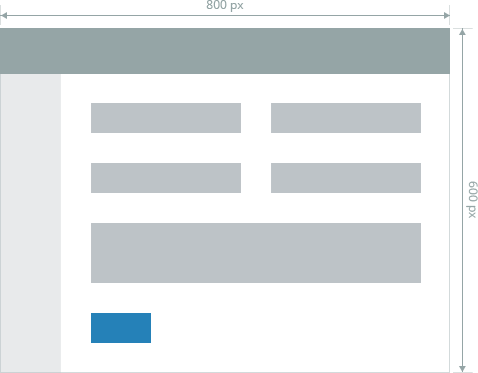
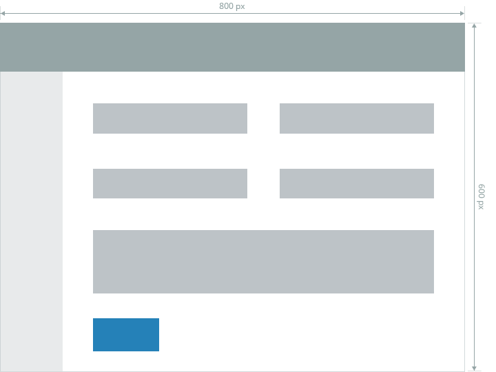
- 7.5 Plugin screenshots aspect ratio should be 1.33, for example 800x600px.
- 7.6 Theme screenshots aspect ratio should be 1.5, for example 990x660px.
- 7.7 Screenshots shouldn't be wider than 1200 px.
- 7.8 Theme screenshots should have width of at least 850px.
- 7.9 Plugin screenshots should have width of at least 838px. The ideal plugin screnshot size is 838x630px.
- 7.10 Screenshots shouldn't contain Windows task bar or MacOS dock.
- 7.11 Screenshots shouldn't contain the browser window frame or its elements (scrollbars, Chrome footer address panel, etc.).
- 7.12 Screenshots shouldn't contain the windows shadows.
- 7.13 Screenshot images shouldn't be resized (squeezed) with image editors to accommodate to the size requirements.
- 7.14 Screenshots should use the 100% browser zoom (fonts shouldn't be reduced or enlarged).
- 7.15 Use the standard, non-customized theme for the back-end screenshots.
- 7.16 Screenshots should be displayed in the English language.
- 7.18 Maximum number of plugin screenshots is 5.
8. Icons
- 8.1 Icons should be transparent PNG images.
- 8.2 The original image size should be 64x64px.
- 8.2 Icons images should correspond the plugin purpose or use a clear metaphor.
- 8.3 It is highly recommended to use vector icons converted to PNG images. For example, see the Forum plugin icon.
- 8.4 Use quality images, without compression artifacts.
- 8.5 It is recommended to use brand icons for integration plugins.
- 8.6 Plugin icons should have round corners or transparent background.
9. Back-end user interface
- 9.1 Try to use existing form controls and UI elements and patterns instead of creating new ones.
- 9.2 Custom controls should follow the general design style of the back-end user interface.
10. Banner image
You can add a banner image to your plugin. Banner is displayed on the plugin details page below the plugin name and short description. Banners could help you to differentiate your product and make it more noticeable. Plugins that have a quality banner graphics are more likely to be added to customer projects.
- 10.1Use a PNG image with size 837x348px for banners.
- 10.2Banners should be aesthetic: carefully cropped, with a margin between the banner contents and the image border.
11. Categories
Please select appropriate categories for your plugins and themes - this will help visitors to find your products. For plugins you can choose up to 2 categories. If you have difficulties with choosing categories for your plugin, review the marketplace and find products with similar functionality. Contact us if you think that a new category should be created.