
New items
- Pickadate (datepicker and timepicker)
- TimePicki (timepicker)
- MiniColors (colorpicker)
Available languages
- en - English
- hu - Magyar
Credits
- Datepicker: Pickadate
- Timepicker: TimePicki
- Colorpicker: MiniColors
More premium plugins
- Content Plus - Complete solution for Blog, News, Portfolio, Slideshow and Testimonials in one plugin. Many features and client-friendly interface.
- Backend Elite - Use amazing back-end features and fresh dashboard widgets. Gzip compression, CMS cleaner, right-click menu, etc.
- Login Page - Customize your back-end login page! You can change the background color or image, hide the logo or slogan and so on...
- Hospitality - This is the complete hospitality plugin with booking table, quick reservation and menu features. Manage your restaurant or cafe easily.
More free plugins
- Backend Plus - Extend the back-end to some features and widgets.
- News & Newsletter - This is a simple news and newsletter plugin.
- Developer Tools - Edit plugins with the online code editor.
- Front-end Plugins - List of components which are use in front-end.
- Blog Stats & Graphs - Extended the Blog with graphs and widgets.
- User Plus - Extend the RainLab User plugin to some new fields.
- Paste Content - Paste snippets or HTML blocks to the CMS or plugins.
- Quick Edit - Edit easily the CMS pages via dashboard widget.
- Popup Manager - Easy to manage popups and collect subscribers.
- Photography - Manage your photos and photo equipment easily.
Installation via Command Line
php artisan plugin:install Indikator.Form
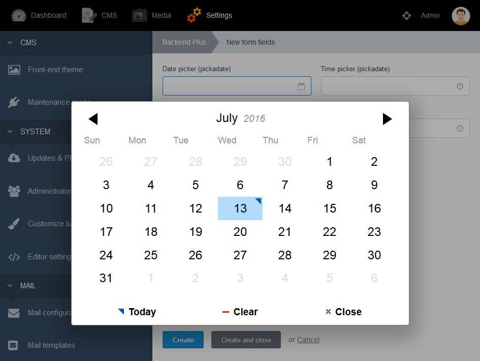
Pickadate
pickadate - renders a text field used for selecting date and times.
date:
    label: Date
    type: pickadate
    mode: date
| Option | Description |
|---|---|
| mode | the expected result, either date, datetime or time. Default: datetime. |
| selectYears | display select menus to pick the year. Default: false. |
| selectMonths | display select menus to pick the month. Default: false. |
| interval | choose the minutes interval between each time in the list. Default: 30. |
See the demo: http://amsul.ca/pickadate.js
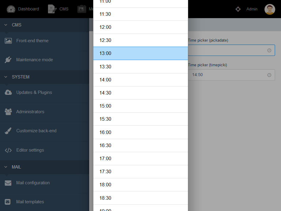
TimePicki
timepicki - renders a text field used for selecting times.
time:
    label: Time
    type: timepicki
    stepSizeMinutes: 10
| Option | Description |
|---|---|
| increaseDirection | set increase hour or minute direction. Default: 'down'. |
| customClasses | add custom class name in timepicki for our own like css purpose. Default: ''. |
| minHourValue | set minimum hour which means we can set minimum value of hour. Default: 0. |
| maxHourValue | also can set maximum hour same like minimum hour. Default: 23. |
| showMeridian | you can choose to hide the AM/PM selector. Default: false. |
| stepSizeHours | the step size with which hours have to increase or decrease Default: 1. |
| stepSizeMinutes | the step size with which hours have to increase or decrease Default: 1. |
| overflowMinutes | that hours will be updated if we go over the maximum/minimum of the minutes counter. Default: false. |
| disableKeyboardMobile | prevent keyboard to show up on mobile, side effect: you can't type your hour on desktop keyboard anymore either. Altering hours and minutes with arrows is still possible. Default: false. |
| reset | if want to reset time in input, to enable reset option. Default: false. |
See the demo: http://senthilraj.github.io/TimePicki
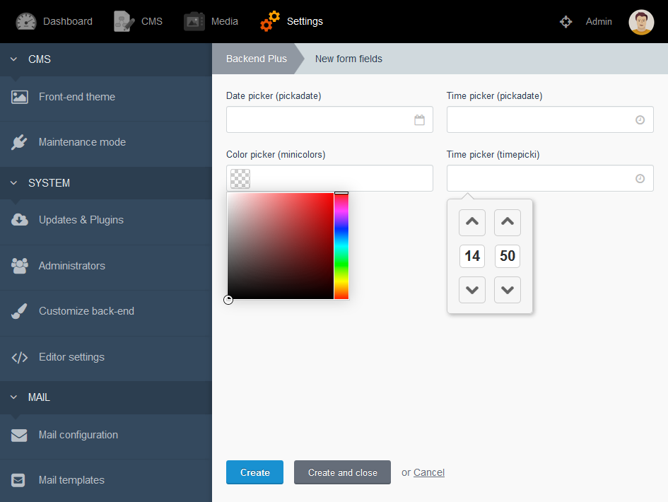
MiniColors
minicolors - renders controls to select a color value.
theme:
    label: Choose color
    type: minicolors
    control: wheel
| Option | Description |
|---|---|
| animationSpeed | the animation speed of the sliders when the user taps or clicks a new color. Default: 50. |
| animationEasing | the easing to use when animating the sliders. Default: 'swing'. |
| changeDelay | the time, in milliseconds, to defer the change event from firing while the user makes a selection. Default: 0. |
| control | determines the type of control. Valid options are 'hue', 'brightness', 'saturation', and 'wheel'. Default: 'hue'. |
| format | the format MiniColors should use. Valid options are 'hex' and 'rgb'. Default: 'hex'. |
| hideSpeed | the speed at which to hide the color picker. Default: 100. |
| keywords | a comma-separated list of keywords that the control should accept (e.g. inherit, transparent, initial). Default: ''. |
| letterCase | determines the letter case of the hex code value. Valid options are 'uppercase' or 'lowercase'. Default: 'lowercase'. |
| position | sets the position of the dropdown. Valid options are 'bottom left', 'bottom right', 'top left', and 'top right'. Default: 'bottom left'. |
| showSpeed | the speed at which to show the color picker. Default: 100. |
See the demo: http://labs.abeautifulsite.net/jquery-minicolors
| 1.0.0 |
First version of Form Widgets. Sep 24, 2018 |
|---|