
OctoLanding
OctoLanding is a multi-functional theme, with a full-fledged tool for creating your own landing from ready-made blocks in a short time. live-demo1 and live-demo2
Solutions used:
- Bootstrap 4 - a popular grid that allows you to get full adaptability
- Font Awesome 4.7.0 - large library of icons, makes it easy to add new icons to the site
- Owl Carousel 2.3.4 - popular library for creating sliders
- Lightgallery 1.6.11 - simple and functional gallery
Basic possibilities:
All of the following features are ready to go right now.
- It's easy - no programming knowledge is required to create a full-fledged landing page;
- Constructor - create your own unique landing page. Do what you want with the blocks: move the finished blocks to places, duplicate or delete them (And also, a double choice of caps, and your Landing’s basement);
- Variability - Each block has many settings that change its content and appearance, which allows you to use the blocks again to display the necessary information;
- Built-in plugin - allows you to easily customize the type of blocks on the site, has several configuration settings, more information in the documentation;
- Email alert - if a user has filled out a form, you will receive an email to your email with the form data;
- Meta tags - easy customization of tags.
Short review

The following plugins are required

Static Pages
Adds static pages, menus and breadcrumbs features to October CMS.
Static Pages
Adds static pages, menus and breadcrumbs features to October CMS.

Sitemap
Generate a sitemap.xml file for your website.
Sitemap
Generate a sitemap.xml file for your website.

Image Resizer
Easily resize and compress images. Provides Twig filter and PHP method. Works well with plugins such as blog,...
Image Resizer
Easily resize and compress images. Provides Twig filter and PHP method. Works well with plugins such as blog,...

GoogleMaps
Google Maps plugin for OctoberCMS
GoogleMaps
Google Maps plugin for OctoberCMS

Robots.txt
Simple generating robots.txt
Robots.txt
Simple generating robots.txt

Landing Builder
Plugin specifically for theme `OctoLanding`
Landing Builder
Plugin specifically for theme `OctoLanding`

Installation via Command Line
php artisan theme:install Zen.OctoLandings
1. Where to start
First of all, after installing the theme, check the availability of the “OctoLanding” item in the plugins menu - if there is one, then you can proceed to create your own landing. If it is missing, then try to log out and go to the administrative panel, did not help? These plugins must be installed without fail:
2. The procedure for building landing
Landing building is divided into the following steps:
- Creating a configuration profile and active it;
- Selection of blocks;
- Creation of copies of blocks and their filling;
- The location of the blocks on the page and edit their settings;
- Other.
2.1 Creating a configuration profile and active it
The OctoLanding plugin built into the theme allows you to create multiple configurations, and it is easy to switch between them. So let's move on to creation, to create a configuration profile, click on the “OctoLanding” item in the control panel in the left menu, select the Theme Settings item and click the Create button.
Fill in all the required fields. Please note that under each field there is a comment that allows you to understand the purpose of this field. After successful filling save settings. In the left menu, select “Theme Settings” a list of created configurations will appear, make sure that the previously created configuration is active, this is indicated by a green indicator opposite the name!
Attention! For the theme to work properly, it is necessary that any configuration be active. When you activate any configuration, the rest are automatically deactivated!
2.2 Selection of blocks
Before you select the blocks that will be used on your page, you need to consider them in more detail. In the current theme there are 9 ready blocks:
- Slider - Block Slider One Image and Text
- Slider - Five Slider Images
- Application - Two Field Form
- Contact - Two Tiles Text and Map
- Block 1 - Block Tiles Icon and Text
- Block 2 - Two Tiles Text and One Slide
- Block 3 - Four Image slide Background
- Block 4 - Slider One Four Icon
- Block 5 - Text Area and Img
Such names of the blocks was made so that the user could quickly and conveniently select and configure the block he needed, below is the decryption of the name using the example of the first block:
Slider - Block Slider One Image and Text
The first word - “Slider” is the name of the menu item in the “OctoLanding” plugin, the second word is “Block Slider One Image and Text” and it contains the appearance of the plugin.
Below we consider each block in more detail:
2.2.1 Slider — Block Slider One Image and Text
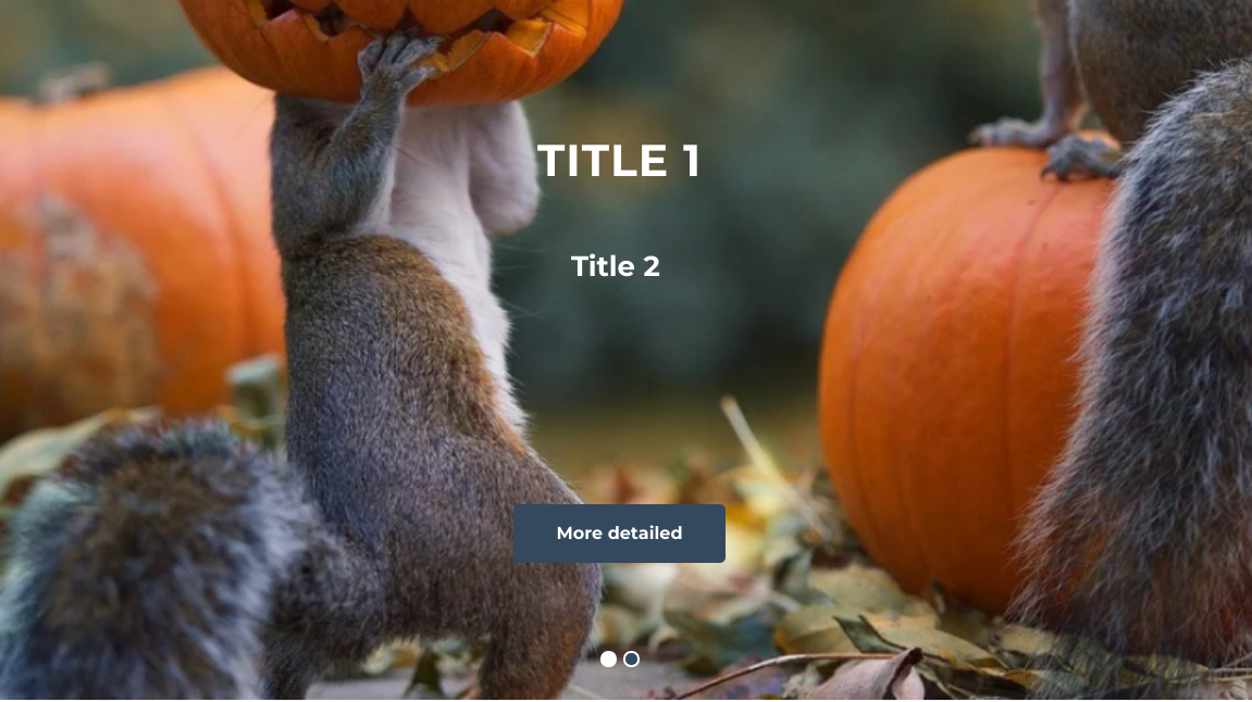 Image 1. The appearance of the block Slider — Block Slider One Image and Text.
Block description
The block is a single slide, the entire width of the screen.
Main features
The block has two text fields for adding a first-level heading (Title 1) and a second-level heading (Title 2); this block also provides the ability to add a button (More detailed) with a link both to the block and to any other address. If these fields are not filled in, the slider will consist of just a picture.
2.2.2 Slider — Five Slider Images
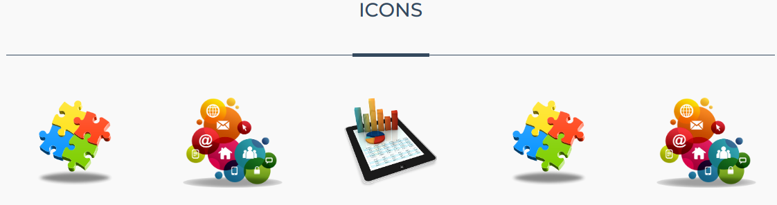 Image 2. The appearance of the block Slider — Five Slider Images.
Block description
The block consists of 5 slides, which are limited in width by the container Bootstrap 4.
Main features
This is a simple block that has one field heading (Icons). If there are more than 5 images in the slider, then the arrows for navigation will appear. All blocks in the theme are adaptive, so the number of images in the slider varies depending on the width of the screen:
- ≥ 320px - 1;
- ≥ 500px - 2;
- ≥ 768px - 3;
- ≥ 998px - 5 elements.
2.2.3 Application — Two Field Form
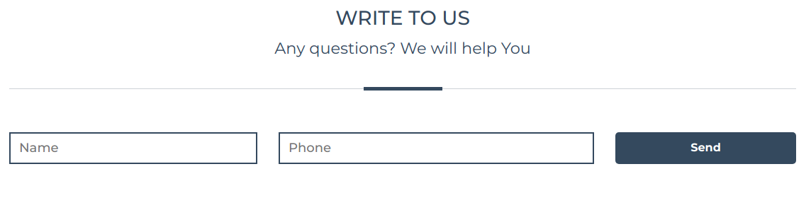 Image 3. The appearance of the block Application — Two Field Form.
Block description
The block is designed to collect user information, namely "Name" and "Phone", can be more one in page, as all the presented blocks. The block is limited in width by the Bootstrap 4 container.
Main features
Block settings allow you to set the block name (Write to us), add or remove a subtitle (Any questions? We weill help you) and change the text of the send button (Send). After filling in the fields, the administrator will be notified via Email, and all applications can be viewed in the “OctoLanding” plugin - "Applications". The user who filled in the fields after sending will receive a message about the successful sending.
2.2.4 Contact — Two Tiles Text and Map
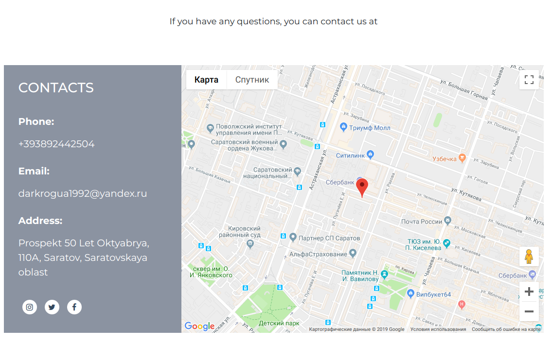
Image 4. The appearance of the block Contact — Two Tiles Text and Map. 8
Block description
The block is designed to display contact information with a Google map showing the location, if this block is excessive for You, we recommend using the extended "Footer". The block is limited by the width of the Bootstrap container 4.
Basic possibilities
User can set block name (Contacts), add subtitle (If you have any questions....) Add item "Phone" - when you click on the content of this item will be added to the link prefix" tel: "for the item" Email "will be added prefix" mailto: "for the item" Other " prefix will not be added. Social networks will be added automatically and their settings are common for the whole theme! Refer to social networks to set them up. For correct Google maps meets third-party plug-Graf Graf.Google maps it needs to be installed! Important to display the map, you must obtain the Api key.
2.2.5 Block 1 — Block Tiles Icon and Text
 Image 5. The appearance of the block Block 1 — Block Tiles Icon and Text.
Block description
A block is a set of 2, 3 or 4 elements in a row (selected in the settings), each of which contains an image and a title (element 1) and text that is displayed to the user when you hover (in the image on the right) closing the image and title. If you do not fill this field, then nothing will happen when you hover. The block is limited in width by the container Bootstrap 4.
Main features
The user can change the title (Title), short content (Short descriptions) and add new elements.
2.2.6 Block 2 — Two Tiles Text and One Slide
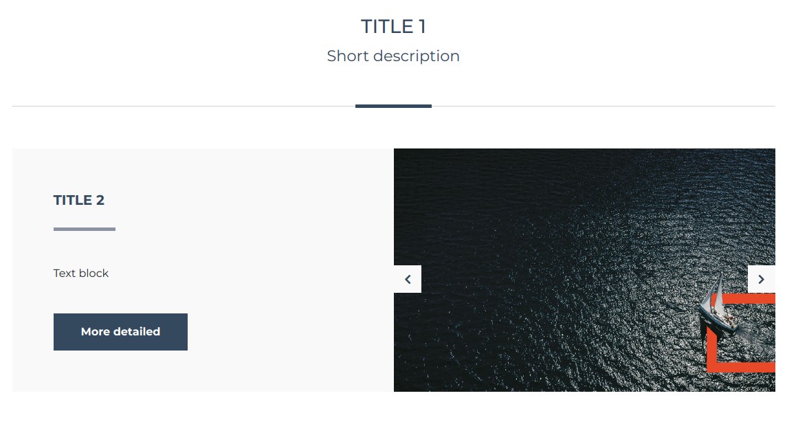 Image 6. The appearance of the block Block 2 — Two Tiles Text and One Slide.
Block description
This block can contain an unlimited number of elements. Each element added to the block is divided into two parts: text (Title2, Text block, More detailed) and a slider with one image. The block is limited in width by the Bootstrap 4 container.
Main features Elements added to the block can be inverted if necessary (change the text part and the slider in places). Add the “More detailed” button to the elements (the user will be displayed if the user has filled out the link field). Create anchor links for the item.
2.2.7 Block 3 — Four Image slide Background
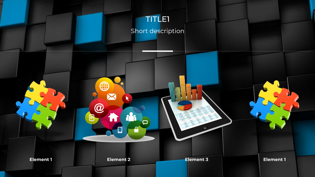
Image 7. The appearance of the block Block 3 — Four Image slide Background.
Block description 8 The block occupies the entire width of the screen, is a slider with its background consisting of 4 elements, depending on the width of the screen, the number of elements decreases.
Main features
On this block, you can set your background as a third-party image, or fill the background with color. When you click on the elements of the block, the gallery opens with these blocks (can be turned off). If there is no description of the elements (Element1, Element2 ...), the description will not be displayed. If there is no block description (Short description), the description will not be displayed.
2.2.8 Block 4 — Slider One Four Icon
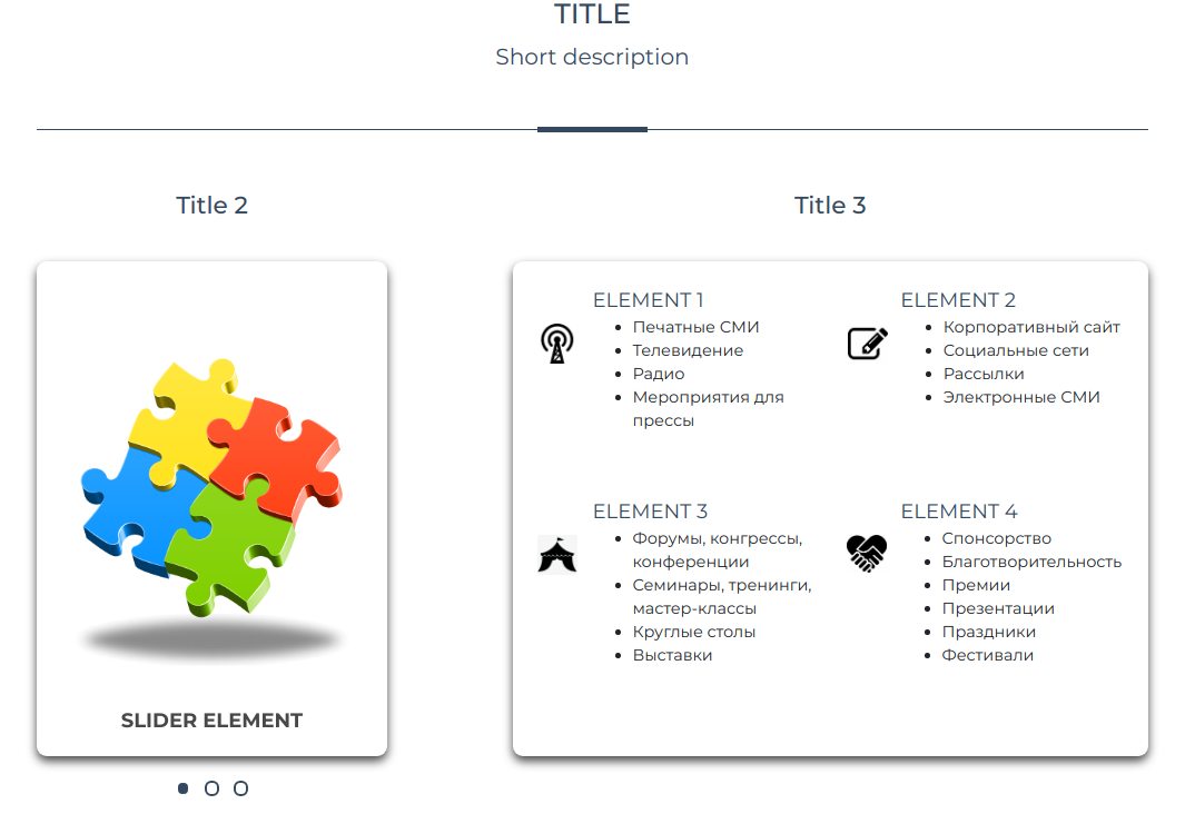
Image 8. The appearance of the block Block 4 — Slider One Four Icon.
Block description
It is divided into two parts: a slider and a text section. The block is limited in width by the container Bootstrap 4.
Main features
The left and right parts of the block have equal height, therefore, it is not recommended to place more than 4 elements in the text block otherwise it will be difficult to choose an image for the slider. Slider simultaneously displays only one image.
2.2.9 Block 5 - Text Area and Img
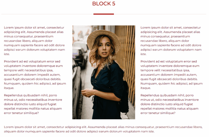
Image 8. The appearance of the block Block 5 - Text Area and Img.
Block description
The block is limited in width by the container Bootstrap 4. The universal text block with the image, allows has 6 different types:
- Text - Image - Text (fill in all the fields);
- Image - Text (do not fill in the text field 1);
- Text - Image (do not fill in the text field 2);
- Only Text (fill in text box 1 or text box 2);
- Text - Text (fill in text box 1 and text box 2);
- Together with any above (сlick add new block) ;
Main features
Due to the fact that the blocks can be combined with each other, you can create unique designs.
3. Creation of copies of blocks and their filling
After reviewing in clause 2.2 with ready blocks, you can proceed to the creation of their copies. A block instance is a copy of a block with its own data. To create an instance of a block, select the OctoLanding item in the control panel, select the required menu item and click the create button, fill in the fields and save. Consider the example of Block 1 - Block Tiles Icon and Text. From the name of the block you can see that to create an instance of this block, the menu item named “Block 1” responds to the current item and press the CREATE button.
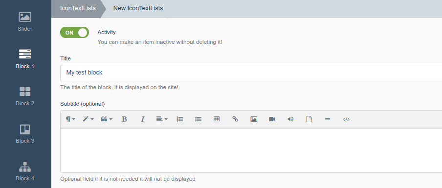
Image 9. Creating an instance of Block 1. Customize headings and subheadings.
Turn on the item Activity - this item enables or disables the block on the site Fill in the Title field - this will be the title for Block 1 (what the comment about the field tells us) If you need a subtitle, fill in the Subbtitle field, if you do not want to display it, then leave this field blank, as in image 9.
Now you need to add items to the block, below the Content tab, click on the “Add item” button, the fields for the item will appear, we will move on to filling them out.
Fill in the field Title is the title of the element inside the block Select an image for the item in the Icon field - displayed in the item to the left of the title (see clause 2.2) If we want some text to appear on hover over this element, then fill in the Content block field, otherwise we leave it blank. See the example of filling in image 10. Click the Create and close button. The block instance is created.
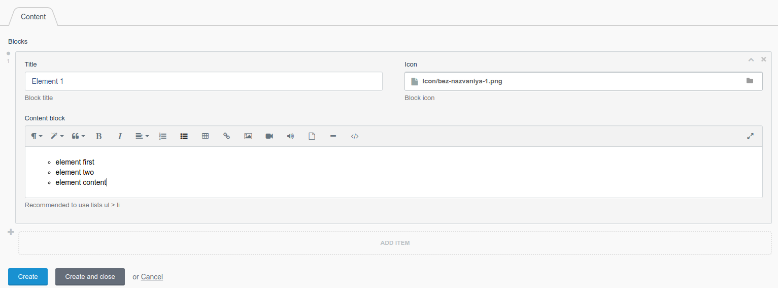 Image 10. Creating an instance of Block 1. Adding elements to the block.
By analogy, create for blocks where Slider is needed. Please note each instance has its own unique ID, according to this ID which instance of the block will be displayed on the page!
3.1 Below is an example of creating an instance of a slider
In the control panel, select the item "OctoLanding", select the item Slider. Immediately we get a list of all previously created slides (a slide is an image in the slider). But before creating slides, you need to create a slider that will contain them, to do this, click on the “Sliders” button (the blue button in Image 11)
Image 11. An example of creating a slider.
We press the create button, enter the slider name and click “Create and close”; excellent slider is created; now you need to fill it with Slides (images). To do this, click "Back to slides" or in the left menu on "Slider". Now you can go to create a slide. Click the Create button (see Image 11.). Fill in the basic fields:
- Title - Slider title (shown only in the list of sliders);
- Slider - Choose a previously created Slider! Thus, we attach the current slide to a specific slider;
- Image - Load the image that will be on the slider;
- Slide Text - Serves as the main text of the slider, if you do not need the text, leave the field blank;
After the required fields, there are additional fields that only in the Slider - Block Slider One Image and Text block, if you fill it in and connect this slider in another block, the field will not appear.
- Additional field - Additional text field;
- Link - if the field is filled, then the button “More detail” will appear on the slide.
Click "Create and close", a slider with one slide (image) is created, if necessary, create a few more slides for the current slider.
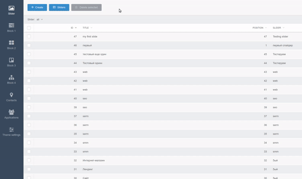
Image 12. An example of creating a slide.
4. The location of the blocks on the page and their settings
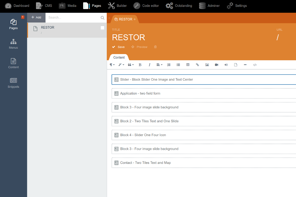
In the control panel, click on the "Pages" item, select the page on which you want to add blocks (usually this is the main '/'). In the left pane, select the Snippets item. In this item, there are blocks that you can add to their website. 8. Clicking on the desired snippet (block) will automatically add it to the page. To add further blocks, move the mouse over the current block and the "new line" symbol will appear, click on it and select a new block, etc.
Image 13. The location of the blocks on the page
Attention! It is recommended to add blocks one by one, otherwise each newly added block will be the first!
Block settings (snippet) - Each block added to a page, depending on its type, has its own settings, with the exception of the basic ones, they are present in all blocks:
- Block URL (string) - anchor link to the block, this is a unique parameter that allows scrolling to the current block from the menu item;
- Block Margin (checkbox) - adds or removes padding from the top and bottom to the block;
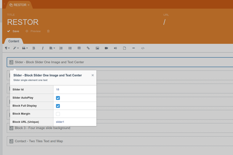
- Block Full Display (checkbox) - sets the height of the block equal to the height of the user's screen. Other possible parameters:
- Block ID (integer) - in which you must specify the block instance ID (see clause 2.3);
- Slider ID (integer) - in which you must specify the ID Slider ʻa, not to be confused with Slides (see para. 3);
- Slider AutoPlay (checkbox) - enables or disables autoscrolling slides;
- Grid Size (dropdown) - indicates the size of the grid for the block;
- Button text (string) - the text of the send button in the Application block;
- Text under the heading (string) - the text under the heading in the Application block;
- Block name (string) - block name.
After adding the block to the page, configure the snippet fields, specify the necessary parameters and click save!
Go to the page and check that the block is displayed correctly.
5. Other
5.1 Social Networks
Social networks on the site are displayed in 3 places:
- Mobile version of the caps;
- Basement, if the configuration includes a full basement item (see item 1);
- Contact block - Two Tiles Text and Map.
The type of social icons in these 3 places is the same and is controlled from one place. To edit, go to Pages - Menus - Social Icon link
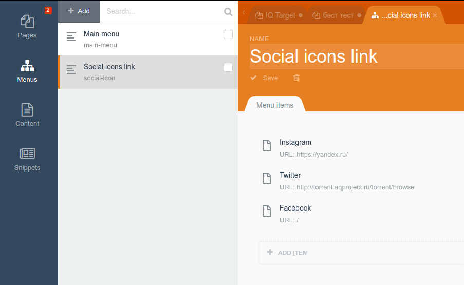
Image 14. Manage social icons.
To add a new icon, click Add Item, consider an example of adding an icon.
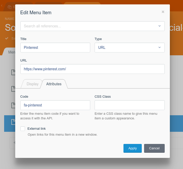
Image 15. Manage social icons. Adding an icon
In the Title field enter the name of the icon (for yourself only)
In the URL field enter the link to your page.
Go to the Attributes tab and in the Code field, paste the code to the icon taken from the FontAwesome 4.7 library. In this case, the element code looks like this <i class = "fa fa-pinterest" aria-hidden = "true"> </i>
You only need to write fa-pinterest, see image 15.
Click Apply and Save.
5.2 Website Menu
Site menus on the site are displayed in 2 places:
- The header of the site
- Footer, if the full footer item is enabled in the configuration (see item 1)
To edit, go to Pages-Menus — Main Menu. It is filled in the same way as point 5.1, except that the Code field should be left empty!
5.3 Scroll to block
Each block added to the page has a block URL parameter, if this parameter is filled, you can scroll smoothly to this block by clicking on the button or on the menu item that references the current block.
- Make sure the block filled Block URLS (for example - block 42)
- Add or edit a menu item (see section 5.2) by specifying the #block42 parameter in the URL field
- This is done
-

András
Found the theme useful on 22 Jun, 2019
Hello.
This is amazing, thank you, this is exactly what i want, looks superb, very useful and very easy to use!
However, i discovered a little problem the background images wont show, it shows the default image instead of them, for example: FourImgSlideBgcs Edit FourImgSlideBgcs background image wont appear.
I tried to make a new slider and attach to sections, but is get the default "thank you" images insted my slider.
Please, check it.
-

| 1.1.2 |
Fixed block twoBlockIcon May 15, 2019 |
|---|---|
| 1.1.1 |
Add Full display block2 and fixed mobil version block2 Apr 19, 2019 |
| 1.1.0 |
Fixed bug SEO meta tags and add two plugins suport Robots.txt and Sitemap Apr 05, 2019 |
| 1.0.9 |
Add switch column contacts or row header1 and add arrow slider mobil version Mar 25, 2019 |
| 1.0.8 |
Fixed hover a tag block map Mar 04, 2019 |
| 1.0.7 |
Fixed bug hover tag a, and block contacts fixed css Mar 02, 2019 |
| 1.0.6 |
Fixed header2 and fixed text block mobil and pc version, other fixed bug. Feb 13, 2019 |
| 1.0.5.1 |
Fixed display of blocks with default data Feb 06, 2019 |
| 1.0.5 |
Add new header Feb 06, 2019 |
| 1.0.4 |
Add new Text block Feb 05, 2019 |
| 1.0.3 |
Fixed a bug where some blocks during scrolling and resizing Feb 05, 2019 |
| 1.0.2 |
Edit name theme Jan 29, 2019 |
| 1.0.1 |
Theme initialization Jan 29, 2019 |