

Check out the live demo site!
A gallery plugin for professional Photographers, Media Artists, Bloggers and Content Publishers.
November Gallery enables you to display folders of images that you've uploaded to your website as galleries. This greatly helps digital publishers since they no longer have to rely on a clunky "Gallery" interface to upload their images, they can use FTP or whatever tool of their choice. BUT a "Clunky" back-end gallery interface is still provided if you wish to add titles and subtitles to your images, and it adds some other features not available with "folder-based" galleries. Once uploaded, you can select from many different ways to present your images to your visitors, such as: in-page gallery, clickable tiles laid out masonry style, a pop-up "light-box" type gallery, a responsive "swiper", etc. You can also show videos.
- Upload your images either using the Media Manager built into OctoberCMS or through the dedicated galleries backend page
- Drop November Gallery onto your page or partial or static page
- Select the folder you uploaded your images to and how you want them displayed using the component inspector, or in your RainLab blog entry
Behind the scenes, November Gallery makes use of the Image Resizer functionality built into OctoberCMS v2+ to generate thumbnails of your images, and the excellent UniteGallery jQuery Gallery Plugin as well as Swiper.
Please note that November Gallery is in no way affiliated with OctoberCMS, I just really liked the idea of naming things after months and November is one of my favorites!
Features:
- Works in Pages, Partials, "Static" Pages, and Blog Posts!
- Six components included:
- Embedded Gallery if you wish to show a gallery of images or thumbnails in your page, arranged in various layouts: tiles (arranged in columns, justified, or laid out in a grid "masonry style"), carousel, slider, or combined (large image + lightbox)
- Swiper Gallery for responsive, multi-platform galleries
- Popup Lightbox for galleries that can be opened from a link or button on your page, with several available styles (wide, compact)
- Video Gallery for...videos, again, with several "styles" available (thumbs / titles + subtitles / titles only)
- Image List Only if you want to handle the display of the images yourself and only need a list of image objects
- Gallery Hub to generate a page with links to all (or only some) of your galleries
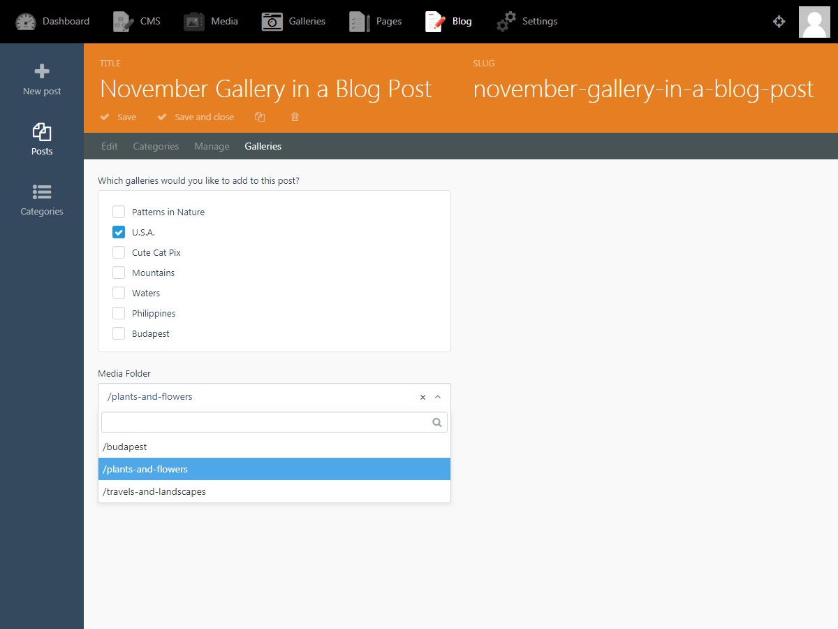
- Set which folder of images to display in the component configuration panel OR pass it dynamically as a page-variable OR set it in your RainLab blog entry
- Responsive/touch enabled/skinnable/themable/gallery buttons/keyboard control etc.
Usage
(1) Prepare and Upload your Images
You can choose to upload your images either using the "Gallery" page in the October back-end, or you can use the built-in Media Manager.
Hint: The dedicated back-end November Gallery management page gives you more options for giving your images titles and subtitles, and you can also arrange the order easily; on the other hand, if you ever end up deleting the plugin, October will also delete all of your albums created there. Use the October built-in Media Manager to upload your images if you don't need the extra features provided by the November Gallery management page. Going the Media Manager route also allows you to upload hundreds of images using an FTP client or other file manager; this is not possible through the Gallery page.
Although the plugin will automatically generate thumbnails of your pictures, the full-size images will be displayed as-is. Therefore, it's a good idea to resize all of your pictures before uploading them to the gallery. A plethora of free options exist to help you with that, we ♥ FastStone Image Viewer (Windows), Fast Image Resizer (Windows), and Image Resizer for Windows. There are great options out there for Mac as well. A typical screen resolution nowadays is around 1920 x 1680 pixels - so if you're looking to allow your users to see your pictures in top quality full-screen, then resize them to fit within these constraints.
Also, make sure that your photos are in a format that web browsers understand, such as .jpg or .png, or .gif (the latter is more suitable for graphics with fewer colors and geometric lines, such as charts or icons).
Finally, upload your pictures using the "Gallery" admin area, or through the October Media manager into the folders you created earlier.
Uploading through the back-end Gallery management page
This is fairly self-explanatory. Log into your site back-end and find the "Gallery" button at the top. Create an album, and upload your pictures!
Uploading through the Media Manager
Images must be organized into folders. Although you can use any folder structure that you'd like, we recommend that you create a "root" folder and create separate folders underneath it to store your albums. You can optionally create separate "root" folders to store your images, videos, and blog pictures. Avoid using spaces or special characters in your folder names. Your folder structure may look like this:
- my_galleries
- my_travels
- 2018-argentina
- 2015-vietnam
- 2010-hungary
- cat_pictures
- awesome_vacuum_cleaners
- my_travels
Uploading using FTP
This is the most robust way for uploading many pictures at once to your site. Use an FTP client such as FileZilla (Windows) or WinSCP (Windows) or Panic Transmit 5 (Mac) and connect to your server. Your media files will be located in public_html/storage/app/media. You can create new folders through FTP as well, and if you then use the back-end media manager, you'll see them.
(2) Configure The Plugin
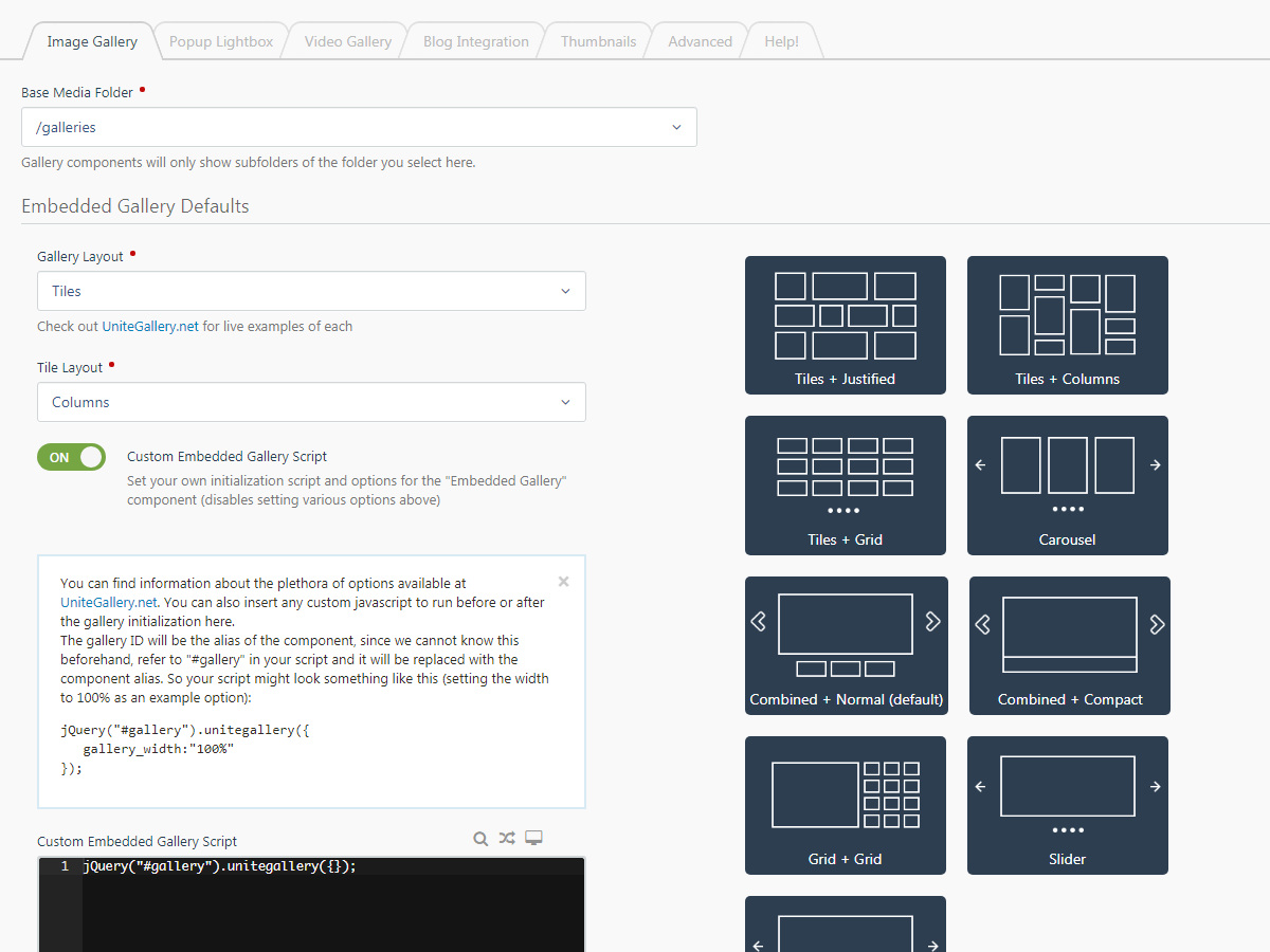
Log into your "backend" and go to Settings → November Gallery to configure your defaults. Things to look out for:
SettingsTab: Select the folder that you created your galleries under from the Base Media Folder drop-down, you can also select a default layout for your galleries.ThumbnailsTab: It is recommended to use the image resizer to automatically generate thumbnails of your pictures. For this, make sure that the "Use Image Resizer" option is ON on the Thumbnails plugin configuration tab. You can also set either the width or the height for your thumbnails here.AdvancedTab: Inject UniteGallery Assets should probably be on. If your theme already includes jQuery, then you can set Inject jQuery to OFF.
(3) Drop the Plugin Onto your CMS Page(s)
The plugin provides four components that you can drop onto your CMS Pages/Partials/Layouts, it also works as a "Snippet" in static pages. Each option on the component inspector comes with (i) hints, so you should have no trouble understanding how to use it. Please see the Documentation tab for a description of each component option.
Components
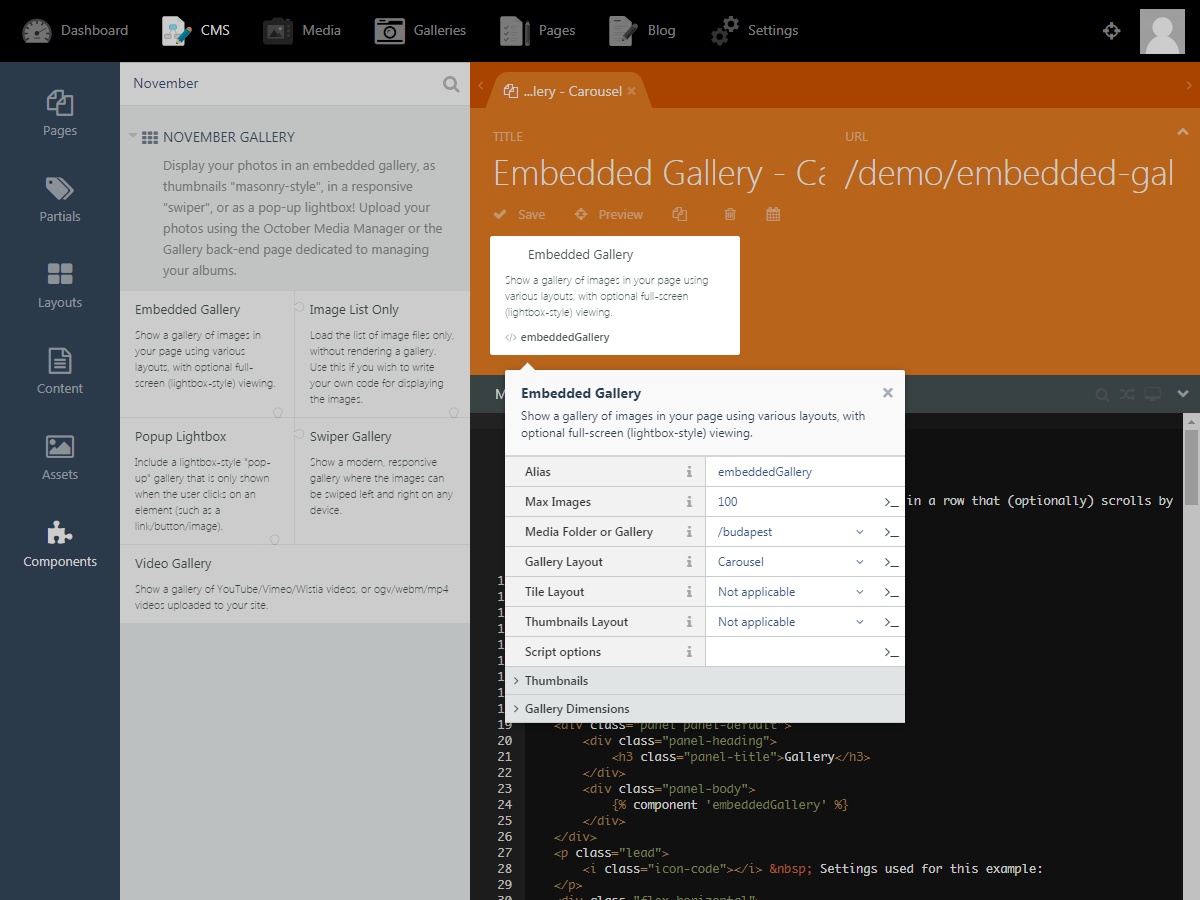
The Embedded Gallery Component
This gallery makes use of UniteGallery JS. Use it to show a gallery of thumbnails, or a gallery "embedded" into your page, with optional full-screen (lightbox-style) viewing.
Hint: Use the Embedded Gallery for fix-size galleries or for showing clickable thumbnails arranged as tiles
Several gallery layouts are available:
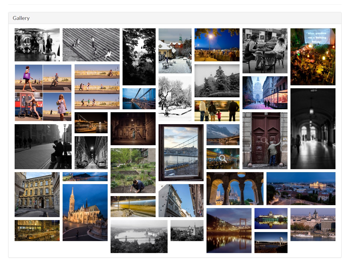
Tiles
This gallery displays your images as clickable "tiles" that open a popup lightbox. It really looks best if your images have differing dimensions, some tall, some landscape, some square, etc. You can choose from four tile layouts: Columns, Justified, Nested, and Grid.
Carousel
This gallery displays your images in a row that (optionally) scrolls by itself.
Combined
This gallery combines a large image with a row of thumbnails. It works best if your images are relatively small and have the same dimensions. There are three themes available: Normal, Compact, and Grid.
Slider
This gallery is similar to the "Combined" gallery without a strip of thumbnails.
The Swiper Component
This makes use of Swiper. Use it to create a modern, responsive "swiper" that can be controlled easily from any device. Note that you can control any of the galleries by touch (or click-and-swipe using a mouse). Various transitions are available: "fade", "slide", "flip", "cube", etc..
Hint: The Swiper Component is really geared towards responsive galleries because by default it fills whatever container it is in.
The Popup Lightbox Component
This makes use of a custom UniteGallery JS theme. Use it to create a pop-up lightbox of images that can be opened from a link or button (or any other clickable component) on the page. Two styles are available: "Wide" and "Compact".
The Video Gallery Component
Again, this makes use of UniteGallery JS. Use it to display videos inline. You can choose to upload your videos to your website or to show videos hosted on YouTube/Vimeo/Wistia.
Image List Only Component
Well, we probably could have given this component a better name. This component only loads the list of image files into a page variable, without rendering a gallery. Use this if you wish to write your own code for displaying the images, or if you wish to make use of some other JS library to render them.
Gallery Hub Component
This component loads a list of galleries without actually rendering any galleries. Use this if you wish to show a "hub" page with a link to all of your galleries. If you have many galleries, you can assign keywords to them and then create hubs that only display those galleries that match a certain keyword. By default the component creates an unordered list of the preview images set for each gallery, you can override this either by setting a custom template or by writing your own logic using Twig.
Where to now?
Install the plugin and give it a test drive!
You can also read:
- The November Gallery Cookbook
- The November Gallery Demo Site
- The November Gallery Source Code on GitHub
- Our OctoberCMS Blog Quick Start Guide
- Our introduction to The OctoberCMS Ecosystem

Installation via Command Line
php artisan plugin:install ZenWare.NovemberGallery
Aloha! I am Laszlo, the main developer of this plugin. I've worked hard to make this plugin available for you, and I've made it open-source so that if you are using the plugin for non-commercial purposes, you can grab the code from GitHub and use it for free. I would like to ask you for a favor in return. Please don't leave a negative review if you encounter issues or find that something is missing. Contact me first, and give me chance to make it into a five-star product for you.
You can reach out to me by clicking "Product Support" on the left, or by raising an issue on GitHub. You can also chat with me on Gitter. Give me a few days to respond - I may get busy with other stuff but I will get back to you and I will genuinely appreciate that you took the time to help me improve this plugin. And if you end up using it on a commercial project, consider purchasing the professional edition - you will be supporting not only my work but October as well.

This is an abridged version of the full documentation that we call The November Gallery Cookbook.
November Gallery Pro vs. Personal
This plugin is available in two editions:
- The Personal Edition is a free plugin meant for non-profit use, such as:
- Building a personal website that is not offering a product or services for sale
- Academic use
- Use by non-profit organizations
- The Pro Edition is meant for commercial use, such as:
- A website selling or promoting products or services
- Use by a for-profit organization
In terms of functionality, the two plugins are identical. November Gallery Pro is available from the OctoberCMS Marketplace. The Personal Edition is available from GitHub. You will need to install it yourself - follow the README on the GitHub project page.
What is November Gallery?
November Gallery is essentially a scaffolding over various Javascript-based visualization libraries. JS is great for displaying the images because it runs in the user's browser and can immediately react to changes in its environment, for example, a user turning their phone from vertical to horizontal, or resizing their browser. What November Gallery does is provide a framework within OctoberCMS for managing your images and building templates that include gallery "definitions". From an admin's/site content editor's perspective, you (1) get a "Gallery" page in your "backend" and (2) you get various components that you can drag-and-drop onto your CMS pages/partials. Additionally, it also provides (3) "Snippets" to use in your "Static" pages (if you have the Static Pages plugin installed), and (4) it also integrates with the RainLab Blog Component, if you have it.
For rendering your galleries, November Gallery provides you with various options, but it makes use of two JS libraries to do so. The various components it makes available to you really just help with configuring how the JS scripts are run so that you get a "swiper" or a "popup" gallery etc. You do not have to understand how these JS libraries work, but reading about the available configuration options will enable you to customize your galleries further than if you just use the options available through the November Gallery component property pages.
Deployment
Note: You must have a
{% styles %}and{% scripts %}tag in your layout header/footer so that the plugin can inject the required assets.<head> {% styles %} </head> <body> {% page %} {% scripts %} </body>
Installation
To install from your site "backend": go to Settings → Updates & Plugins → Install Plugins and then search for "November Gallery".
To install from the Marketplace: click Add to Project and select the project you wish to use the plugin on. Once the plugin has been added to your project, from the backend area of your site click the Check for updates button on the Settings → Updates & Plugins page to pull in the plugin.
Component Options
[Shared Options]
| Property | Inspector Name | Description |
|---|---|---|
alias |
Alias | Standard OctoberCMS stuff, you refer to the component in your page via this unique identifier, the default is "embeddedGallery" but you can change it to anything you want (don't use spaces or special characters though!) |
mediaFolder |
Media Folder | Select the folder that you uploaded the images to in the OctoberCMS Media manager. Only folders under the "Base Media Folder" set on the November Gallery settings page are valid. |
maxItems |
Max Images | The maximum number of images to display |
sortBy |
Order by | Order to display the gallery items in; note: Image Title, Description, and Sort Order only work for images uploaded using the Galleries page! Options are: (1) title / Image Title (2) description / Image Description (3) sortOrder / Image Order in Gallery (4) width / Image Width (5) height / Image Height (6) orientation / Image Orientation (7) fileName / Filename (8) fileSize / File Size (9) uploaded / Date/Time Uploaded; and all options are also available in reverse order (append DESC onto the option code). |
Component 1: Embedded Gallery
Use this if you wish to show a gallery of images within your page using various layouts, with optional full-screen (lightbox-style) viewing.
[Options]
The following are available in addition to the Shared Options described above:
| Property | Inspector Name | Description |
|---|---|---|
galleryLayout |
Gallery Layout | Select a gallery layout; possible values are: (1) default / Default (use the gallery layout set on the plugin settings page) (2) gallery_tiles / Tiles (3) gallery_carousel / Carousel (4) gallery_combined / Combined (5) gallery_slider / Slider |
tilesLayout |
Tile Layout | Only applicable if the Gallery Layout is set to "Tiles"; possible values are: (1) default / Default (use the default gallery layout set on the plugin settings page) (2) gallery_tiles_columns / Columns (3) gallery_tiles_justified / Justified (4) gallery_tiles_nested / Nested (5) gallery_tiles_grid / Grid |
combinedLayout |
Thumbnails Layout | Only applicable if the Gallery Layout is set to "Combined"; possible values are: (1) default / Default (use the default thumbnails layout set on the plugin settings page) (2) gallery_combined_default / Normal (default) (3) gallery_combined_compact / Compact (4) gallery_combined_grid / Grid |
additionalGalleryOptions |
Script options | Additional JS options that you want passed onto the UniteGallery script, for example: theme_panel_position: 'bottom' |
imageResizerWidth |
Thumbnail Width | Width of the generated thumbnail; Leave empty or set to 0 to only constrain the image by height; leave both width and height empty to fall back on the values set on the backend plugin configuration page |
imageResizerHeight |
Thumbnail Height | Height of the generated thumbnail; Leave empty or set to 0 to only constrain the image by height; leave both width and height empty to fall back on the values set on the backend plugin configuration page |
imageResizerMode |
Thumbnail Mode | Select how to resize your images into thumbnails, or select "default" to use the thumbnail mode set on the plugin settings page; possible values are: (1) Default (2) Exact (3) Portrait (4) Landscape (5) Auto (6) Crop |
galleryWidth |
Gallery Width | Can be a number (pixel lenght) or a percent (of the parent container). Leave empty to fall back on the values set on the backend plugin configuration page |
galleryHeight |
Gallery Height | Only applies to "Combined" and "Slider" galleries! Can be a number (pixel lenght) or a percent (of the parent container). Leave empty to fall back on the values set on the backend plugin configuration page |
Component 2: Swiper
Use this component to create a modern, responsive "swiper" that can be controlled easily from any device. Note that you can control any of the galleries by touch (or click-and-swipe using a mouse). Various transitions are available: "fade", "slide", "flip", "cube", etc..
[Options]
The following are available in addition to the Shared Options described above:
| Property | Inspector Name | Description |
|---|---|---|
effect |
Transition Effect | Tranisition effect. Can be "slide", "fade", "cube", "coverflow" or "flip" |
direction |
Direction | Can be "horizontal" or "vertical" |
speed |
Transition Speed | How long the transition effect lasts, in milliseconds. 1000 = 1 seconds. |
lazyLoad |
Lazy-load images? | Toggle ON to only load the images the user is looking at. Previous and next images are set to pre-load automatically. |
addPagination |
Add pagination? | Toggle ON to show bullets (or anything else) that enable to user to jump to any specific slide. |
addNavigation |
Add navigation? | Toggle ON to show previous-slide and next-slide navigational arrows. |
autoplay |
Auto-play? | Toggle ON to enable automatic advance on the slides. Set the delay below. |
autoplayDelay |
Auto-play Delay | How long each image is shown for, in milliseconds. 1000 = 1 seconds. |
additionalGalleryOptions |
Script options | Additional JS options that you want passed onto the Swiper script, for example: fadeEffect: {crossFade: true} |
useDescriptionAsCSS |
Description is Style | Inject the image description as CSS for that image; only works for images uploaded through the backend Gallery page. |
mediaQuery |
Media Query | You can set a media query to only apply the style in certain circumstances. Do not include a trailing "{". For example: @media screen and (max-width: 766px) and (orientation: portrait) |
Example Page
<div style="width: 100%; height: calc(100vh - 70px);">
    {% component 'swiperGallery' %}
</div>
The swiper component by default fills whatever space it is in, in this case we set the container DIV to take up 100% of the viewport and be 100vh tall.
Component 3: Pop-up Lightbox
Use this if you wish to add a lightbox-style 'pop-up' gallery to your page that is only shown when the user clicks on an element (such as a link/button/image).
[Options]
The following are available in addition to the Shared Options described above:
| Property | Inspector Name | Description |
|---|---|---|
attachTo |
Attach to | JQuery selector for the element(s) that the user can click on to open the lightbox; for example: #gallery-button |
additionalLightboxOptions |
Script options | Additional JS options that you want passed onto the UniteGallery script, for example: theme_panel_position: 'bottom' |
Example Page
{% component 'popupLightbox' %}
<button id="gallery-button">Click me!</button>
This is a simple example where you place a button onto the page. Select a folder of images from the "Media Folder" drop-down in your inspector, and set the gallery "Attach to" option to #gallery-button. Your button should then serve to open a lightbox gallery of all of the images in the selected folder.
Component 4: Video Gallery
Use this gallery to display videos inline. You can choose to upload your videos to your website or to show videos hosted on YouTube/Vimeo/Wistia.
[Options]
The following are available in addition to the Shared Options described above:
| Property | Inspector Name | Description |
|---|---|---|
videoGalleryItemsSelector |
Gallery Selector/ID | JQuery selector for the element that holds the video items; for example: #videos |
videoGalleryLayout |
Gallery Layout | Select a gallery layout; possible values are: (1) default / Default (use the gallery layout set on the plugin settings page) (2) video_gallery_right_thumb / Thumbnails (3) video_gallery_right_title_only / Titles Only (4) video_gallery_right_no_thumb / No Thumbnails |
additionalVideoGalleryOptions |
Script Options | Additional JS options that you want passed onto the UniteGallery script, for example: theme_autoplay: true |
imageResizerHeight |
Thumbnail Height | Height of the generated thumbnail; Leave empty or set to 0 to only constrain the image by height; leave both width and height empty to fall back on the values set on the backend plugin configuration page |
imageResizerMode |
Thumbnail Mode | Select how to resize your images into thumbnails, or select "default" to use the thumbnail mode set on the plugin settings page; possible values are: (1) Default (2) Exact (3) Portrait (4) Landscape (5) Auto (6) Crop |
galleryWidth |
Gallery Width | Can be a number (pixel lenght) or a percent (of the parent container). Leave empty to fall back on the values set on the backend plugin configuration page |
galleryHeight |
Gallery Height | Only applies to "Combined" and "Slider" galleries! Can be a number (pixel lenght) or a percent (of the parent container). Leave empty to fall back on the values set on the backend plugin configuration page |
Component 5: Image List Only
Use this if you wish to write your own Twig script for displaying your images, and only need a list of images (that can be found in a given folder) to be loaded into a page variable.
The image list component does not have any options other than the Shared Options described above.
Example Page 1
<div style="display: flex; flex-wrap: wrap; justify-content: center; align-items: center;">
{% for galleryitem in customGallery.gallery.items %}
    <div>
        <a href="{{ galleryitem. }}" target="_blank">
            <img src="{{ galleryitem.url | resize(280, false,  { mode: 'portrait', quality: '90', extension: 'png' }) }}" alt="{{ galleryitem.fileName }}" style="margin: 20px;" />
        </a>
    </div>
{% endfor %}
</div>
This example assumes that your gallery component has the alias "customGallery" and that you have the Image Resizer plugin installed. Thumbnails are generated for the images and displayed in a flexbox, with each thumbnail providing a link to the full-resolution image.
Example Page 2
<div class="container-fluid">
{% for galleryitemchunk in customGallery.gallery.items.sortBy('fileName').chunk(3) %}
    <div class="row">
        {% for galleryitem in galleryitemchunk %}
            <div class="col-xs-4" style="text-align: center;">
                <a href="{{ galleryitem.url }}" target="_blank">
                    <img src="{{ galleryitem.url | resize(280, false,  { mode: 'portrait', quality: '90', extension: 'png' }) }}" alt="{{ galleryitem.fileName }}" />
                </a>
            </div>
        {% endfor %}
    </div>
{% endfor %}
</div>
Again, we are assuming that your component has the alias "customGallery" and that you have the Image Resizer plugin installed. The images are sorted by filename and "chunked" into groups of 3 images, which are then displayed using the Bootstrap grid layout.
Component 6: Gallery Hub
This component loads a list of galleries without actually rendering any galleries. Use this if you wish to show a "hub" page with a link to all of your galleries.
Please see the documentation to learn about all available options.
Check out the Demo Site for live examples of the above.
Page Properties
Please refer to the documentation for detailed information on each available component property.
Known Issues
Issue including CSS when used in a partial
OctoberCMS has a known issue where if a component is dropped into a partial then any CSS that is added to the page by the partial is never actually rendered. This only occurs if the partial is directly inside of a layout, and if the {% styles %} tag is included before the partial.
Workarounds:
- Add your
{% styles %}after your{% partial "..." %} - OR Put your partial inside of a page, and include the page in the layout
- OR Manually add the required CSS to your layout
Support
Feel free to file an issue. Feature requests are always welcome.
If there's anything you'd like to chat about, please join the NovemberGallery Gitter chat!
Credits / Major Dependencies
- UniteGallery jQuery Gallery Plugin
- Swiper
- OctoberCMS Image Resizer plugin
- OctoberCMS :-)
Made with ♥ in Budapest, Hungary by László Lieszkovszky ❖ ZenSoft Hungary
-

Marscelle Pii Digital
Found the plugin useful on 3 Aug, 2022
Hi Laz, great gallery plugin & awesome support - thank you!
-

Scott Burkett
Found the plugin useful on 1 Jul, 2020
This plugin is simply incredible! It has saved me countless hours of fiddling around with various javascript packages. More importantly, Laszlo (the author) is SUPER responsive to issues and feature requests. Can't beat it for the price!!!
-

Laszlo Lieszkovszky author
Replied on 30 Nov, 2021
Thanks so much Scott for the kind words! I'm very happy to hear that the plugin has worked out for you.
Thanks again for taking the time to write your review, Laszlo
-

Endi Hariadi
Found the plugin useful on 23 Feb, 2020
I just bought this plugin but don't know how to get started. I tried to follow the instructions provided to display the image, but it all ended up failing. Are there any tutorial instructions on how to use this plugin?
-
Laszlo Lieszkovszky author
Replied on 23 Feb, 2020
Hi Endi!
I've already replied to your request for support that you posted 2 hours ago, you must not have seen it yet.
Your first step should be to read the instructions on the November Gallery Pro plugin page.
You can also check out the November Gallery Demo Page to see examples of how the plugin is used. You can also read the November Gallery Cookbook, which has more detailed explanation of the features.
If none of these help, I'm here to help. We can continue the conversation in the support ticket you opened recently, or you can also find me on skype, my username is: laszlo.l
P.s. I very much appreciate you giving the plugin a good rating despite having difficulties!
-


| 2.0.6 |
Improve wording regarding sorting Aug 02, 2022 |
|---|---|
| 2.0.5 |
Enable sorting in reverse on Gallery Hub component Aug 02, 2022 |
| 2.0.4 |
Increase limit on gallery name to 190 characters Aug 02, 2022 |
| 2.0.3 |
Fix issue where sorting no longer works on the backend Galleries page Aug 01, 2022 |
| 2.0.2 |
Fixed "Order By" functionality on the Gallery Hub component Aug 01, 2022 |
| 2.0.1 |
Correction to documentation Dec 14, 2021 |
| 2.0.0 |
BREAKING CHANGES! Plugin is no longer compatible with OctoberCMS v1.x! Upgrade for compatibility with OctoberCMS v2.1+ Nov 30, 2021 |
| 1.0.12 |
Upgrade for compatibility with OctoberCMS v2.0+ and composer Nov 29, 2021 |
| 1.0.11 |
Bugfix of issue Sep 22, 2020 |
| 1.0.10 |
New "Gallery Hub" component Jul 09, 2020 |
| 1.0.9 |
Bugfix affecting 1.0.7 when a gallery uploaded using the Gallery back-end page has now "preview image" set Jul 01, 2020 |
| 1.0.8 |
Added ability to pass gallery slug via URL parameter as requested by scott56276 on 7/1/2020 Jul 01, 2020 |
| 1.0.7 |
Added additional gallery properties as requested by scott56276 on 7/1/2020 Jul 01, 2020 |
| 1.0.6 |
Ability to set a custom CSS class (in addition to style) for each image via the image description field Nov 02, 2019 |
| 1.0.5 |
Bugfix for PHP <= 5.3 Sep 25, 2019 |
| 1.0.4 |
Extend Rainlab Blog integration with support for images in media folders Aug 23, 2019 |
| 1.0.3 |
Rainlab Blog integration Aug 23, 2019 |
| 1.0.2 |
Add "Galleries" menu in back-end Aug 23, 2019 |
| 1.0.1 |
First version of NovemberGallery Aug 23, 2019 |
Upgrading from OctoberCMS v1.x to v2.x:
Please make sure to also upgrade to version 2 of this plugin. Additionally, disable or remove the "Image Resizer" plugin if you have it installed.
- Make sure you are using the latest version of composer:
composer update - Your composer.json may be locking you to version 1 of this plugin ("zenware/novembergallery-plugin": "^1.0"), to fix this run:
composer require zenware/novembergallery-plugin ^2.0.1 - The OctoberCMS admin page will not show the current version number of the plugin until you run:
php artisan october:migrate
If you run into issues you can try composer clear-cache. If composer hangs, or you are running into errors, try adding the "-vvv" tag to the failing composer command to get detailed debug info, for example: composer update -vvv. When opening a support ticket please include the results of the failing composer commant.
OctoberCMS v2+: Make sure the plugin is added to your project and then run php artisan project:sync. Alternatively, you can update only the plugin (provided you've previously added it to your project) using: composer update zenware/novembergallery-plugins. Afterwards run php artisan october:migrate to run any migrations.
OctoberCMS v1+ & WinterCMS: For plugins installed from the marketplace, you can just do Settings → Updates & Plugins → Check for Updates.
For plugin installed manually, you can run the following from your project root directory:
USER@SERVER:/var/www/vhost/public_html# sudo -u www-data git -C plugins/zenware/novembergallery/ pull
remote: Enumerating objects: 14, done.
...

   IN OCTOBERCMS v1.x:

USER@SERVER:/var/www/vhost/public_html# sudo -u www-data php artisan october:up
ZenWare.NovemberGallery - v1.0.4: Extend Rainlab Blog integration with support for images in media folders ...

   IN OCTOBERCMS v2+:

USER@SERVER:/var/www/vhost/public_html# sudo -u www-data php artisan october:migrate
ZenWare.NovemberGallery - v1.0.4: Extend Rainlab Blog integration with support for images in media folders ...