

Moonamick: Your All-in-One Solution for Managing Your Website's Content
This plugin is fully compatible with October v2 and v3
Are you tired of creating specialized plugins or fragmented solutions to manage your website's content? The wait is over! We proudly introduce Moonamick, the ultimate plugin that will revolutionize how you handle your texts, images, cards, or image blocks in OctoberCMS.
With Moonamick, that vision becomes a reality. Our plugin provides you with the definitive tool to manage your website's content, without the need to jump between different plugins or deal with complicated interfaces.
How does it work? Moonamick generates content blocks in the backend. Each block receives an ID that seamlessly integrates into your website's template. And that's all you need! Integrating it into your template is super straightforward. With Moonamick, content management becomes child's play.
Worried about loading speed? Worry no more! Moonamick is designed and optimized to ensure your content loads quickly and efficiently. This means your visitors will enjoy a seamless experience no matter how large or complex your site is.
Moonamick is like the chameleon of plugins, adapting to any type of website without breaking a sweat. Whether it's a landing page, a commercial site, a web application, or an elegant corporate website, Moonamick fits your needs like a glove.
Imagine the smiles on your clients' faces when you tell them how easy it is to manage their website. With Moonamick, it's possible, it's easy, and it's straightforward. Simplicity is the key!
Do you need assistance?
We are happy to help!
Send us an email to hello@polilla.studio and we'll reply you as soon as we can.
Or you can visit GitHub Issues Page to report any issues with plugin.
The following plugins are required

Translate
Enables multi-lingual websites and translate website contents.
Translate
Enables multi-lingual websites and translate website contents.

Blank
Advanced Twig filters for link management, enhanced Markdown processing, JSON handling, and custom CSS styling...
Blank
Advanced Twig filters for link management, enhanced Markdown processing, JSON handling, and custom CSS styling...

Installation via Command Line
php artisan plugin:install PolillaStudio.Moonamick
Moonamick components
The moonamick plugin has three components
DisplayContent
This component will inject all the copys and images of a determined section
You can add it to a page using the backend editor or directly in your code
[displayContent]
section = "home"
Once the component is added to a page or partial the global objects moonCopy and moonImage will be available for use:
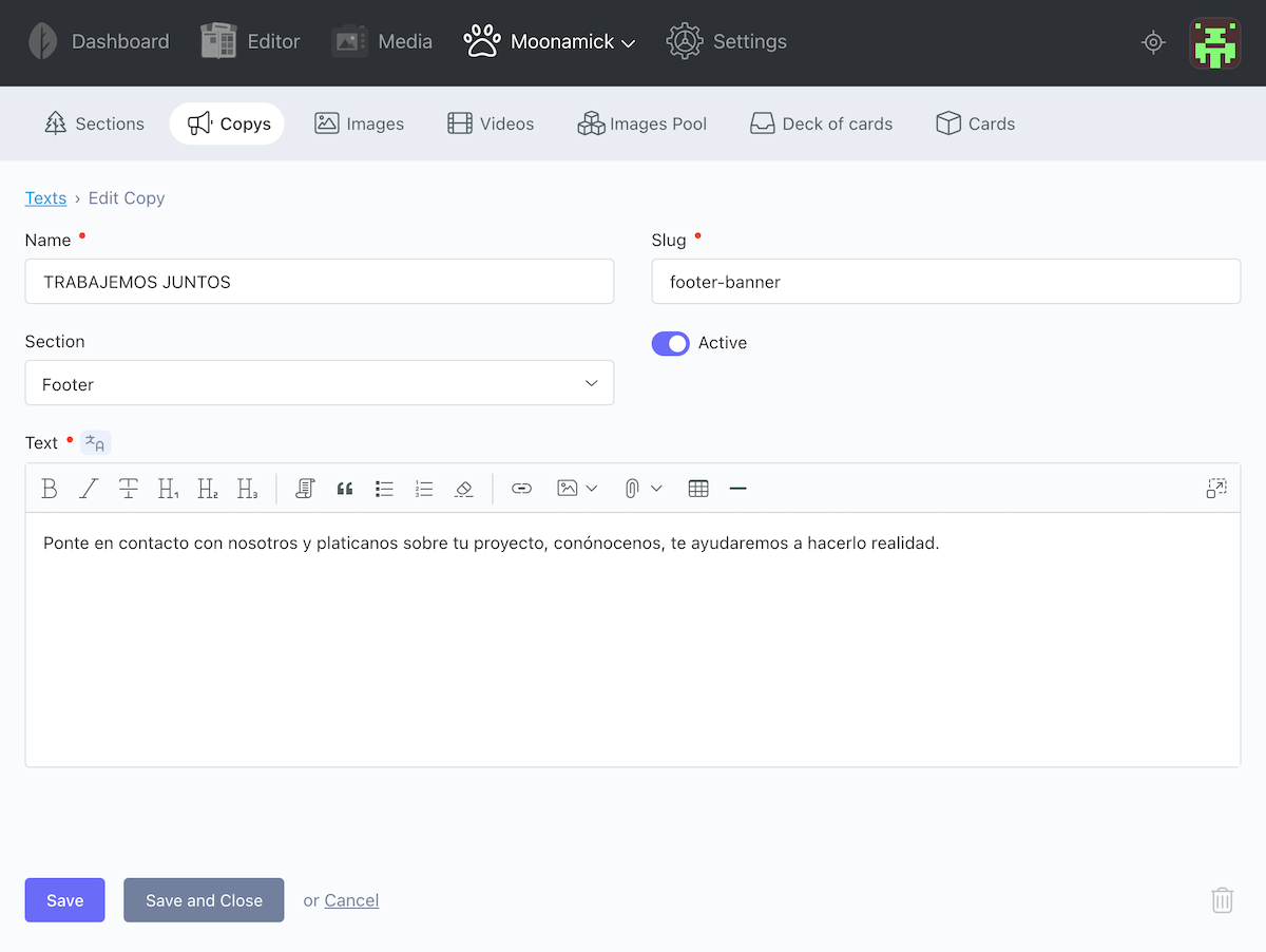
moonCopy
{{ moonCopy['copy-slug'].text }}
Example:
<div class="resume text-center">
    <div class="container">
        <h2>{{ moonCopy['title-about-us'].text }}</h2>
        {{ moonCopy['about-us'].text |md }} //notice you can combine with other twig filters
    </div>
</div>
moonImage
{{ moonImage['image-slug'].path }}
Example
<img src="{{ moonImage['footer-logo'].path }}" width="363">
Additionally, the moonImage has three more properties for each image, useful for SEO
{{ moonImage['image-slug'].name }}

{{ moonImage['image-slug'].title }}

{{ moonImage['image-slug'].description }}
Example
<img src="{{ moonImage['footer-logo'].path }}" alt="{{ moonImage['footer-logo'].description }}" title="{{ moonImage['footer-logo'].title }}">
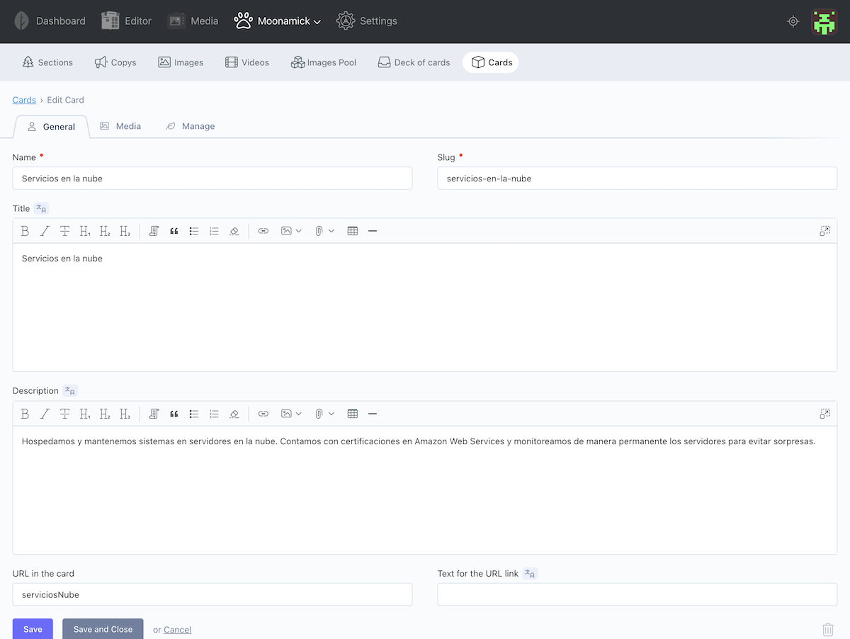
moonDeck
The Deck of cards is useful when you need a block of information than shares structure, for example a pool of services, products or team information.
This component will inject a deck of cards. You can add it to a page or component using the backend editor or directly in to the code
[getDeck]
slug = "deck-slug"
The elements available in the moonDeck object are:
moonDeck.name
moonDeck.title
moonDeck.text
moonDeck.cards
in order to use the cards in the frontend you can use a loop
<div class="row">
    <div class="col-lg-12">{{ moonDeck.title }}</div>
    <div class="col-lg-12">{{ moonDeck.text }}</div>
    {% for card in moonDeck.cards %} //each card of the team
        <div class="col-lg-4">
            <span>{{card.title |md}}</span>
            <img src="{{ card.image.path }}" title="{{ card.image.title }}" alt="{{ card.image.description }}">
            <span>{{ card.description }}</span>
        </div>
    {% endfor %}
</div>
As you notice in the example, the .card.image comes with title and description variables useful for SEO
card.image.title

card.image.description
Card variables available
card.title
card.text
card.url
card.url_text
card.image.path
card.image.title
card.image.description
card.reverse_image.path
card.reverse_image.title
card.reverse_image.description
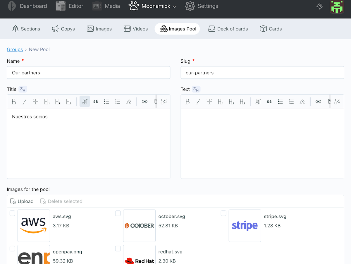
getPool
The Pool of images is a simplified version of the deck of cards. This component is useful when you need to group images with a few information, for example, a group of logos or a small gallery
This component will inject a pool of images. You can add it to a page or component using the backend editor or directly in to the code
[getPool]
slug = "pool-slug"
<div class="container">
    <h2>{{ moonPool.title }}</h2>
    <p>{{ moonPool.text }}</p>
    <div class="client-logos">
    {% for image in moonPool.images %}
        <img src="{{ image.path }}" title="{{image.title}}" alt="{{image.description}}">
    {% endfor %}
    </div>
</div>
Do you need assistance?
We are happy to help!
Send us an email to hello@polilla.studio and we'll reply you as soon as we can.
Or you can visit GitHub Issues Page to report any issues with plugin.
-
This plugin has not been reviewed yet.
-
| 1.0.12 |
Minor fix Aug 14, 2024 |
|---|---|
| 1.0.11 |
New sorting option in moonDeck Component. "Order defined in deck" displays the cards in the order defined in Deck controller Aug 14, 2024 |
| 1.0.10 |
fixed version of dependencies Aug 14, 2024 |
| 1.0.9 |
Sorting cards is available now inside the deck component using drag and drop method Aug 13, 2024 |
| 1.0.8 |
Added md_line filter. Converts a single line from Markdown to HTML format, as an inline element, without <p> Tag. Oct 04, 2023 |
| 1.0.7 |
Sections, Pools and Decks can be selected throug a dropdown in the DisplayContent, GetDeck and GetPool components Sep 04, 2023 |
| 1.0.6 |
Attached files bug fixed Sep 04, 2023 |
| 1.0.5 |
The cards can be sorted in diferent ways and even randomized. Sep 04, 2023 |
| 1.0.4 |
Now it's possible to add a second image to the card, in order to create a reversed image Sep 04, 2023 |
| 1.0.3 |
Adding url and url_text to card Sep 04, 2023 |
| 1.0.2 |
Fix of type string for title and text fields. Changed to text type Sep 04, 2023 |
| 1.0.1 |
First version of Moonamick Sep 04, 2023 |