Getting started with October CMS and Static Pages - v.2
Posted in Tutorials on Aug 29, 2019
This is an updated and improved version of the Getting Started with Static Pages post published in 2014.
In this tutorial, we will demonstrate how to create a website with pages editable in WYSIWYG (What You See Is What You Get) mode, and blogging features. We will use the Static Pages plugin that allows creating a dynamic website structure with pages and menus manageable by non-tech savvy end-users. At the same time, the website will include dynamic blog pages, with content managed with the Blog plugin. All plugins used in this tutorial are free for anyone to install. The ideas from this tutorial can be extended to creating more complex websites. Themes implementing similar features can be found on the Themes Marketplace, but the goal of this tutorial is to show how easy it is to make an October website from scratch.
This is what we will have at the end:
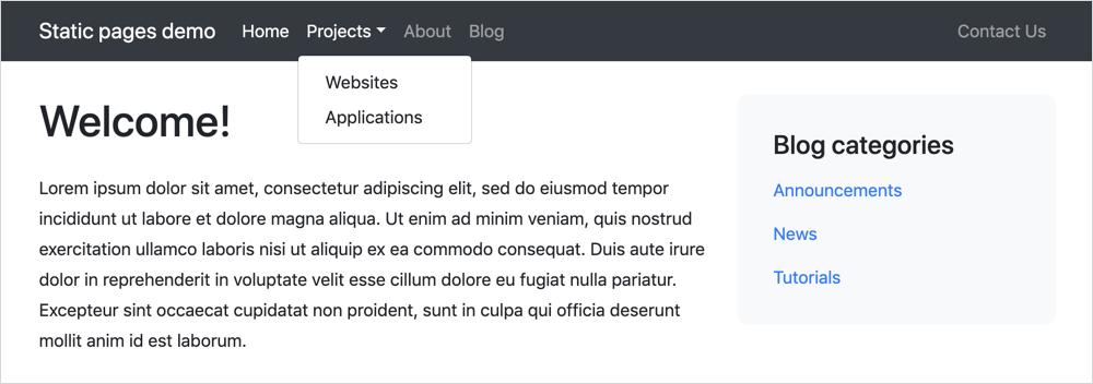
The website theme is completely based on Twitter Bootstrap 4.3. The demo website also includes a simple CSS file that manages some light styling features, such as padding and colors, but since it is not relevant for the topic of this tutorial, it won’t be described in this guide.
Installing October CMS
To install October CMS you must have a web server meeting the minimum requirements. You can use MAMP as a solution to try October on your computer.
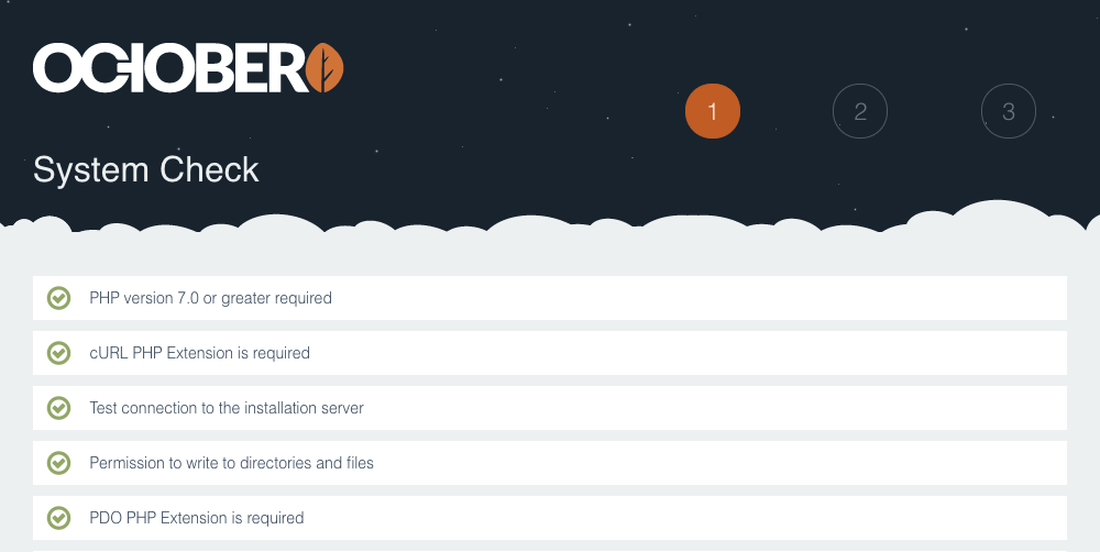
There are several ways to install October CMS. We will use the Wizard Installer option, which is simple and user-friendly. The installation process is explained in the documentation. Create a new MySQL database, download the installer, unpack it to a directory you prepared for October and open the install.php script in a browser.
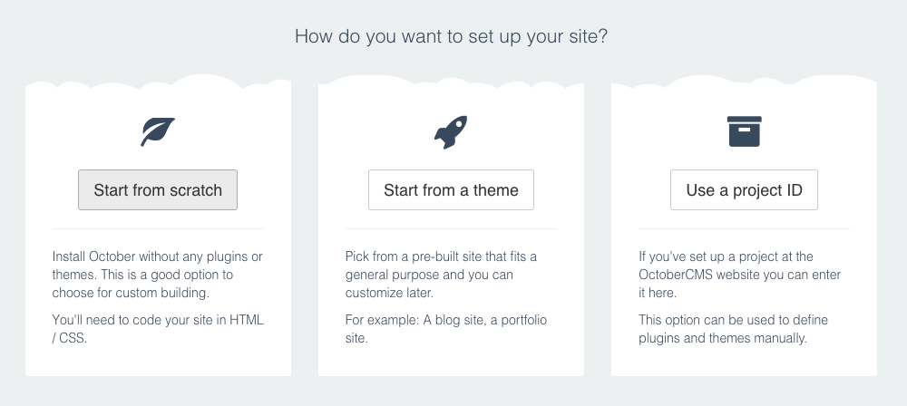
The installation process is fairly straightforward showing the standard prompts, to enter the database details and set up the administrator credentials. On the last step, click Start from scratch. This will create an empty installation with a simple demo theme.
After the installation finishes, click the Administration Area link and log into the October CMS back-end using the credentials you provided during the installation.
Installing Static Pages and Blog plugins
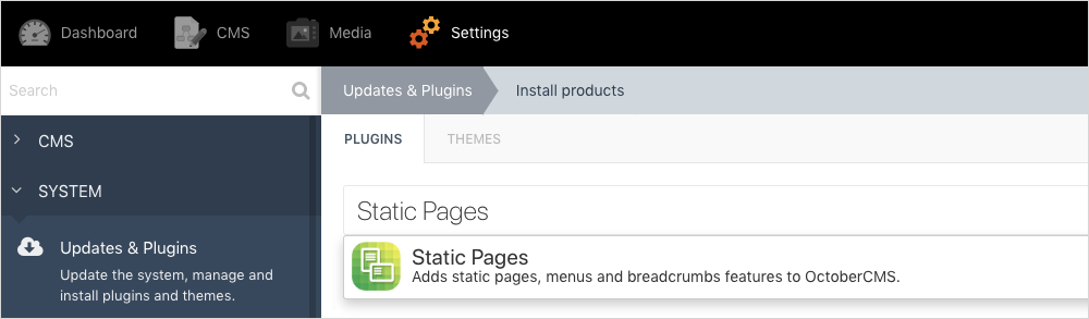
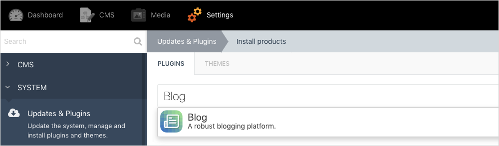
On this step, we will install two plugins required for our little project. In the October CMS Administration Area navigate to the Settings page and click the Updates & Plugins link in the sidebar. Enter “Static Pages” in the search bar and when the plugin list finishes loading, click the Static Pages plugin.
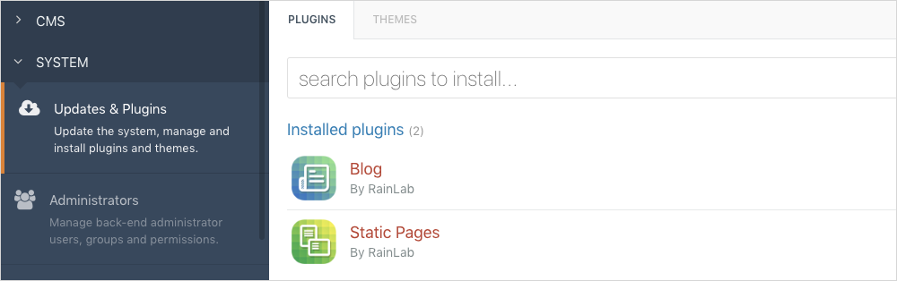
This will install the Static Pages plugin. Repeat the process to install the Blog plugin.
If you did everything right, you should see two plugins installed:
Creating the new theme
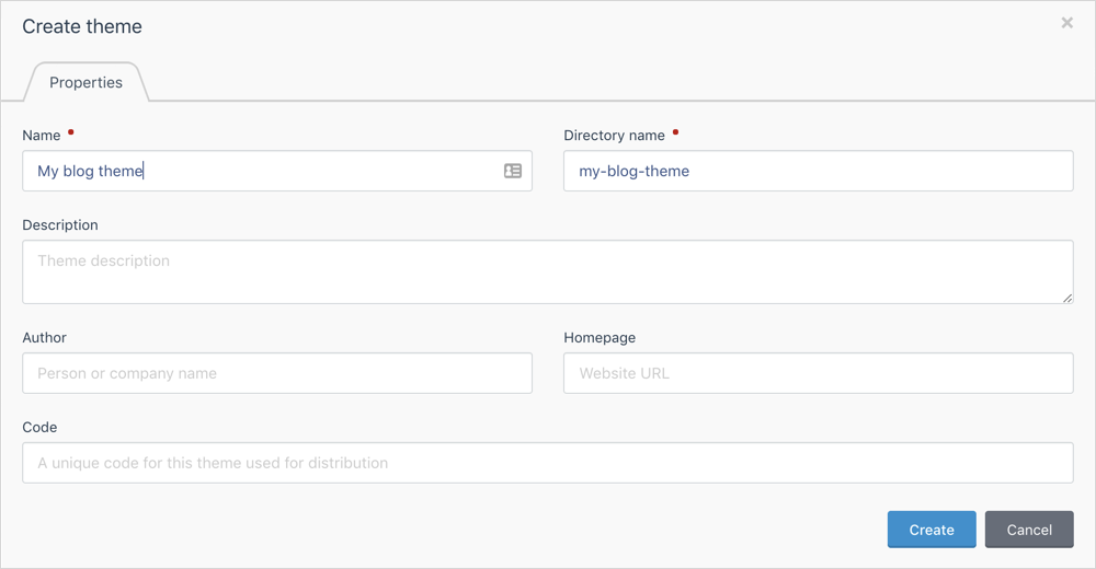
We want to start with a blank theme for our tutorial. To create a new theme, open the Settings page in the October CMS Administration Area and click the Front-end theme item in the sidebar. Click Create a new blank theme link. Enter the new theme name, for example, “My blog theme”. Click Create.
Creating the Layout
In October CMS, Layouts define pages scaffold - usually, they include the HTML, HEAD, TITLE and BODY tags. Almost every CMS page has a layout assigned to it. The simplest functional layout code looks like this:
<html>
    <body>
        {% page %}
    </body>
</html>
Note the {% page %} tag - it gets replaced by the page contents when the page is requested and rendered by October CMS.
For our tutorial, the Layout will define the markup required for a Twitter Bootstrap page. We will basically copy it from the Bootstrap Starter Template example and extend with October CMS features.
To create a Layout, open the CMS editor by clicking CMS on the main menu. Note that using the built-in CMS editor is not a requirement since all theme objects - Layouts, Pages and Partials are just HTML files in the theme directory (although there is an option to use a database instead). This means that you can edit them with your favorite code editor. However, using the CMS editor is preferable for new users.

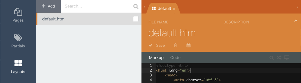
Click the Layouts item in the sidebar and then click Add button. In the Layout editor enter default in the File Name field and click Save (alternatively you can click ctrl+s on Windows or cmd+s on Mac). Paste the following text in the Markup code editor and make sure you save the layout again.
<!doctype html>
<html lang="en">
    <head>
        <meta charset="utf-8">
        <meta name="viewport" content="width=device-width, initial-scale=1, shrink-to-fit=no">
        <meta name="description" content="">
        <title>My blog theme</title>

        <!-- Bootstrap core CSS -->
        <link rel="stylesheet" href="https://stackpath.bootstrapcdn.com/bootstrap/4.3.1/css/bootstrap.min.css" integrity="sha384-ggOyR0iXCbMQv3Xipma34MD+dH/1fQ784/j6cY/iJTQUOhcWr7x9JvoRxT2MZw1T" crossorigin="anonymous">
        <link href="{{ 'assets/css/theme.css'|theme }}" rel="stylesheet">
    </head>
    <body>
        <nav class="navbar navbar-expand-md navbar-dark bg-dark">
            <div class="container">
                <a class="navbar-brand" href="/">Static pages demo</a>

                <button class="navbar-toggler" type="button" data-toggle="collapse" data-target="#navbarsExampleDefault" aria-controls="navbarsExampleDefault" aria-expanded="false" aria-label="Toggle navigation">
                    <span class="navbar-toggler-icon"></span>
                </button>

                <div class="collapse navbar-collapse">
                    <!-- Menu contents will go here -->
                </div>
            </div>
        </nav>

        <main role="main" class="container">
            <div class="row">
                <div class="col-8">
                    {% page %}
                </div>
                <div class="col">
                    <div class="blog-categories-sidebar">
                        <h4>Blog categories</h4>

                        <!-- Blog category list will go here -->
                    </div>
                </div>
            </div>
        </main><!-- /.container -->

        <script src="https://code.jquery.com/jquery-3.3.1.slim.min.js" integrity="sha384-q8i/X+965DzO0rT7abK41JStQIAqVgRVzpbzo5smXKp4YfRvH+8abtTE1Pi6jizo" crossorigin="anonymous"></script>
        <script src="https://cdnjs.cloudflare.com/ajax/libs/popper.js/1.14.7/umd/popper.min.js" integrity="sha384-UO2eT0CpHqdSJQ6hJty5KVphtPhzWj9WO1clHTMGa3JDZwrnQq4sF86dIHNDz0W1" crossorigin="anonymous"></script>
        <script src="https://stackpath.bootstrapcdn.com/bootstrap/4.3.1/js/bootstrap.min.js" integrity="sha384-JjSmVgyd0p3pXB1rRibZUAYoIIy6OrQ6VrjIEaFf/nJGzIxFDsf4x0xIM+B07jRM" crossorigin="anonymous"></script>
    </body>
</html>
As mentioned above, the markup was copied from the Bootstrap Starter Template, with a few additions:
- We added a reference to the
theme.cssasset file. This stylesheet is not relevant for the tutorial. It defines a visual style for the blog categories menu and manages some text styles. - The main container has two columns. The left column contains the
{% page %}tag and will be replaced with the actual page contents by October CMS when an actual page is requested. The right column contains the blog category menu. - The top menu elements were removed. We will replace them with the automatically generated content later in this tutorial.
To make the layout available for Static Pages, we must add the Static Page component to the layout. Click the Components item in the sidebar and click the Static Page component. It is located in the Pages section. This will add the component to your layout. This component does not require any configuration, but you can click it to see the available properties in the Inspector. You can also check the Default layout checkbox to make this layout default for all new pages.
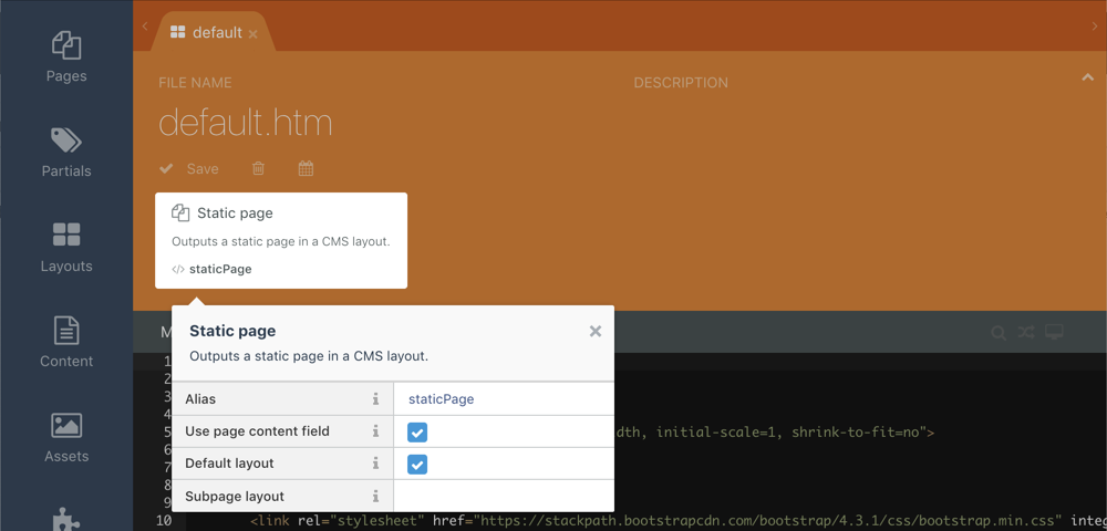
Don’t forget to save the layout before leaving the page!
Creating static pages
Our imaginary website will have the following page structure:
- Home (/)
- Projects (/projects)
- Websites (/projects/websites)
- Applications (/projects/applications)
- About (/about)
- Blog (/blog)
- Contact Us (/contact-us)
All pages except the Blog are going to be static pages. Static pages can be created by end-users without any web development knowledge, in WYSIWYG mode. Let’s now create the static pages.
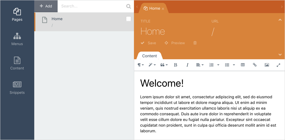
Click the Pages item in the main October CMS menu to open the Static Pages editor.

Click the Add button to create a new static page. Enter Home in the title field and “/” (forward slash) in the URL field. Put any text to the Content field and save the page.
Repeat the same process to create Projects, About and Contact Us page. The Blog page is not a static page, just skip it for now. You can use any URLs for the pages you create. The Static Pages plugin will try to generate URLs basing on the page titles you provide.
As you might have noticed, the Websites and Applications are subpages of the Projects page. To create a subpage, hover over the Projects page in the page list and click the Add subpage link:

The automatically generated URL for subpages will reflect their location, for example, /projects/websites.
You can now test your website by clicking the Preview icon in the top menu of the Administration Area. The icon is located in the right corner, to the left of the user avatar image. If you did everything right, the website now shows the home page and you can try opening other pages by entering their URLs in the browser address bar.
The website top menu and blog category list are not visible yet and we are going to fix this in the following sections.
Creating menus
Now that we have the static pages created, we can create the main website menus. The Static Pages plugin can automatically create the menu structure based on the structure of your static pages, blog categories, and much more. You can add menu items manually, or you can configure the menu to generate its items automatically.
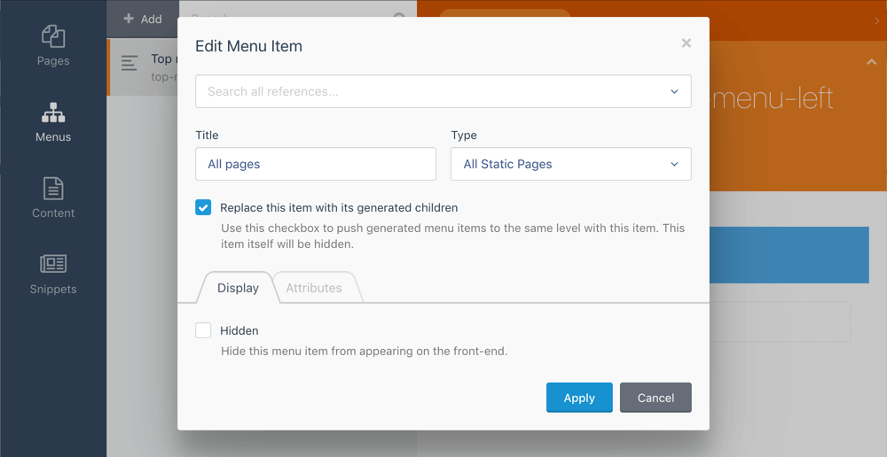
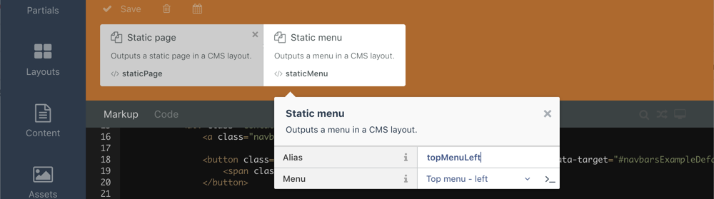
Our website has two menus on the top - the left menu and the right menu. Let’s start with creating the left menu. On the Pages screen click the Menus item in the sidebar and then click Add button to create your first menu. Enter “Top menu - left” in the Name field. Click Add item in the Menu items area.
Enter any value in the Title field - this menu item title will not be visible anyways. Select All Static Pages in the Type dropdown menu. Check the Replace this item with its generated contents checkbox. Save the menu item and the menu itself.
Now we can add the menu to our Layout to make it visible on all website pages. Return to the CMS area, click Layouts and click default.htm layout in the layout list to open the layout in the editor. Now click Components item in the sidebar and click the Static Menu component. Click the new component on the Layout components area to open Inspector and make sure that the Menu property shows “Top menu - left”. Enter topMenuLeft in the Alias property. Save the layout.
Now we are going to have a bit of coding. Bootstrap 4 expects a very specific markup for navbars:
<ul class="navbar-nav">
    <li class="nav-item active"><a class="nav-link" href="...">Active item</a></li>
    <li class="nav-item"><a class="nav-link" href="...">Inactive item</a></li>
</ul>
For drop-down menus, it is a little more complicated.
The Static Pages plugin can generate markup for menus automatically, but the default markup is not specific to Bootstrap - this is just not possible to have a universal markup format that would fit all frameworks. We will create our own partial for rendering menu items, which will be fully compatible with Bootstrap 4. As you might know, October CMS uses the Twig templating engine.
In the CMS area click Partials in the sidebar and then click Add to create a new partial. Enter menu-items in the File Name field and paste the following snippet to the Markup field. Make sure to save the partial when you finish.
<ul class="navbar-nav {{ class }}">
  {% for item in items %}
    <li class="
      nav-item
      {{ item.isActive or item.isChildActive ? 'active' : '' }}
      {{ item.items ? 'dropdown' : '' }}
    ">
      <a
        class="nav-link {% if item.items %}dropdown-toggle{% endif %}"
        {% if item.items %}data-toggle="dropdown"{% endif %}
        href="{{ item.url }}"
      >{{ item.title }}</a>

      {% if item.items %}
        <div class="dropdown-menu">
          {% for subitem in item.items %}
            <a class="dropdown-item" href="{{ subitem.url }}">{{ subitem.title }}</a>
          {% endfor %}
        </div>
      {% endif %}
    </li>
  {% endfor %}
</ul>
The items and class variables are expected to be passed from outside the partial, which we will explain below. The items variable is a list (array) of menu items to render and the class variable specifies the CSS class we want to add to the navbar element. We will use the same partial to display 3 menus: the left side of the main menu, the right side of the main menu and the blog category list.
The class variable is needed to add the mr-auto class name to the top left menu. This class is a part of the Bootstrap layout system. Basically, it will push the top left menu to the left side, and the top right menu - to the right.
The items array contains a list of menu items. You can find full API documentation of the Static Pages menus on the plugin’s documentation page.
Now we can finally display our menus on the page. Open the CMS editor, click Layouts in the sidebar and click our default layout. Replace the <!-- Menu contents will go here --> placeholder with the following line and save the template.
{% partial 'menu-items' items=topMenuLeft.menuItems class='mr-auto' %}The partial tag is a standard feature of the October CMS template engine. It takes the partial name and optional variables to pass to the partial. The code above renders the partial we just created. The items variable loads menu items from the Static Menu component with the alias topMenuLeft, which we created before. The class variable is just a static string with a value required by Bootstrap.
Open the website preview again to see the rendered menu:

Currently, there are two problems with the menu - the Contact Us item is displayed on the left side, although according to our plan it must be on the right side. The other problem is that there is no Blog item on the menu. We will fix both problems in a minute.
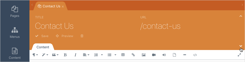
First, let’s fix the Contact Us menu item. Go to the Pages section, click Pages item in the sidebar and click the Contact Us page. Click the small triangle icon on the right side of the editor to access the Settings form:
Enable the Hide in navigation option on the Settings form and save the static page. This will hide the Contact Us static page from the automatically generated menu.

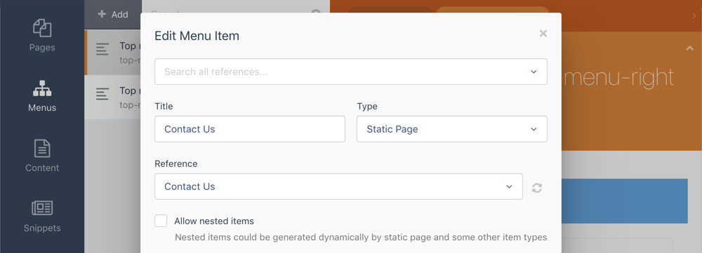
Let’s now create the right-side top menu. Click Menus on the sidebar and click Add to create a new menu. Enter Top menu - right in the Name field. Click Add item and enter Contact Us in the Title field. Select Static Page in the Type drop-down menu and select the Contact Us page in the Reference drop-down menu. Click Apply to save the menu item and also make sure to save the menu itself.
Return to the CMS area and open our default layout in the editor. Add another Static Menu component to the layout. Click the new component to show Inspector, enter topMenuRight in the Alias field and select Top menu - right in the Menu drop-down.
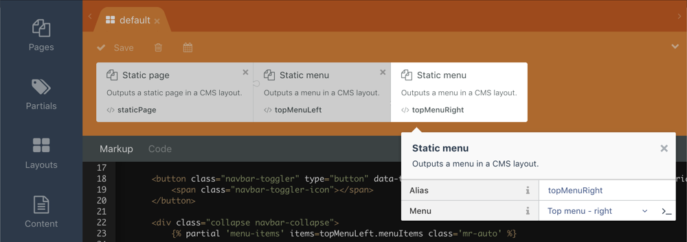
Close Inspector and paste the following line to the Markup section, below the line which you have added for rendering the top left menu:
{% partial 'menu-items' items=topMenuRight.menuItems %}As you can see, we use the same partial as before, but this time we load menu items from the right top menu and do not pass any CSS class. Save the layout and preview the website again:

Congratulations, we are almost there! The last missing menu item is the Blog. Explaining how to add blog features to a website is out of the scope of this tutorial. You can read about creating Blog pages on the Blog plugin documentation page. Assuming that you have already created the blog post page, we can add a menu item to the top left menu.
Open the Pages section and go to the Menus area. Click the Top menu - left menu and click Add Item. Enter Blog in the Title field and select CMS Page in the Type drop-down menu. Select your blog page in the Reference drop-down menu.
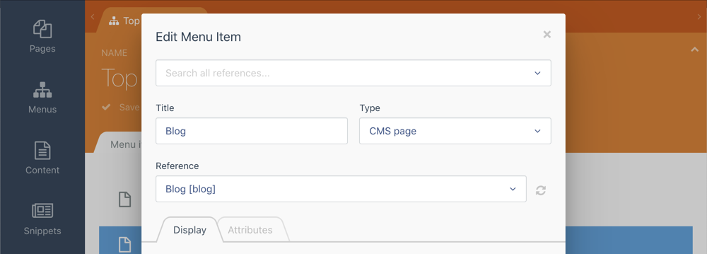
Do not close the menu item editor popup yet. We are going to show a trick that will help us to make the Blog menu item active programmatically on the Blog Category page. Click the Attributes tab in the menu item editor and click enter blog in the Code field. Save the menu item and then save the menu.
You can now refresh the website preview and see our new Blog item on the menu:

Creating the blog category menu
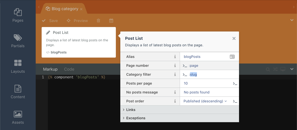
The only missing part of our demo website is the blog category menu. We assume that you have created the blog category CMS page by following the Blog plugin documentation. An important thing for making the blog categories page compatible with the Static Pages plugin is that the Post List component on the categories page must have the Category Filter property to be configured to read its value from the URL parameter:
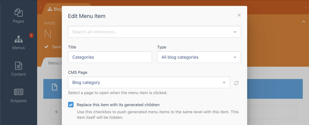
After configuring the blog category CMS page, click the Pages item in the main October CMS menu again and create a new Menu. Enter Blog categories to the Name field and click Add Item. In the menu item editor enter Categories in the Title field. This value does not really matter as this menu item is going to be replaced with menu items based on the blog categories. Select All blog categories in the Type drop-down menu. Select your blog categories CMS page in the CMS Page drop-down menu. Click the Replace this item with its generated children checkbox, save the menu item and save the menu.
We have already added two menus to the layout, the process of adding the third menu is the same. Click the CMS item in the main October menu, open the default layout and add the Static Menu component to the layout. Click the new component and enter blogCategories in the Alias field. Select the new menu Blog categories in the Menu drop-down list. Save the layout.
Now replace the comment <!-- Blog category list will go here --> with the partial tag:
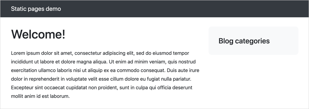
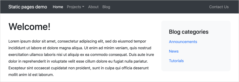
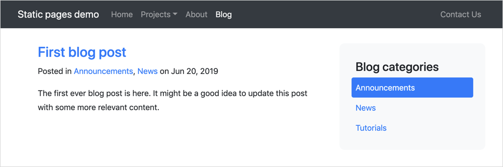
{% partial 'menu-items' items=blogCategories.menuItems class='flex-column' %}Save the layout again and preview the website. If you don’t see any items in the blog categories menu make sure that you have actually created any blog categories! Now the website looks exactly as we wanted.
However, if you click any blog category you will notice that the Blog main menu item is not active. To fix this we will use the Static Pages API to make the menu item active programmatically. Open the Blog Categories page in the CMS editor and paste this little snippet to the Code editor:
function onInit()
{
    $this['activeMenuItem'] = 'blog';
}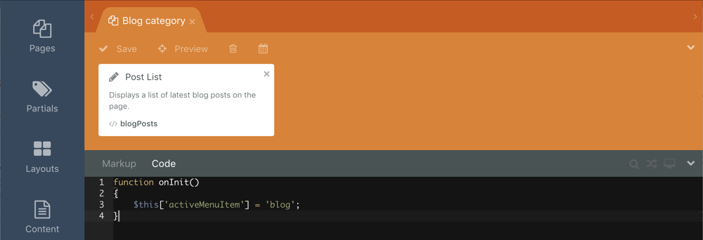
The blog value is the menu item code, which you have specified for the Blog item. And the activeMenuItem is a variable which the Static Pages plugin uses to determine what menu item is currently active. You can read more about the plugin API on the documentation page. Save the page and refresh the website preview - The Blog item is now active.
We hope you enjoyed this tutorial! It took a few hours to write this post, but the process of creating the demo website took as little as 15 minutes. Now you can create websites with mixed static and dynamic pages!