Getting started with Static Pages
Posted in Tutorials on Oct 01, 2014
Today we published the second functional part of the Static Pages plugin - the menu management. This key feature allows you to define as many menus as you need, and create menu items that refer to static pages, URLs, blog categories and so on.
After finishing the menu management we realized that it's even more flexible than we planned and expected. In this tutorial we want to show you a real world use for the Static Pages plugin. We are going to build a simple website that includes several static pages, a top menu and a sidebar menu containing categories taken from a blog. We'll be going over some tricks and ideas that are not covered in the documentation.
Prerequisites
We will be using the Static Pages plugin and the Blog plugin, both are freely available to install, we just need to bind them to a project and update the OctoberCMS installation.
To make the implementation simpler we will use Twitter Bootstrap taken from the CDN in the examples.
The task at hand
Below is the result we want to achieve, a website that has several static pages and some pages have subpages. The top menu contains links to all the static pages on the website. It also contains a link to the Blog page, which is not a static page. The sidebar menu displays links to the blog categories.

Creating the static layout
The first thing we need to do is to create the layout that will host all website pages. As we use the Bootstrap, we need to follow their rules. First, we should create the basic scaffold markup that would include links to the Bootstrap CSS and JavaScript files. Go to the CMS area, select Layouts and create a new layout. This is the code we want to start with. We copied it from the Bootstrap's Navbar Example.
<!DOCTYPE html>
<html lang="en">
    <head>
        <meta charset="utf-8">
        <meta http-equiv="X-UA-Compatible" content="IE=edge">
        <meta name="viewport" content="width=device-width, initial-scale=1">

        <title>{{ this.page.title }}</title>

        <!-- Bootstrap core CSS -->
        <link
            rel="stylesheet"
            href="https://maxcdn.bootstrapcdn.com/bootstrap/3.2.0/css/bootstrap.min.css">

        <!-- Theme CSS -->
        <link href="{{ 'assets/css/theme.css'|theme }}" rel="stylesheet">
    </head>

    <body>
        <div class="container">
            <!-- Static navbar -->
            <div class="navbar navbar-default" role="navigation">
                <div class="container-fluid">
                    <div class="navbar-header">
                        <button type="button" class="navbar-toggle collapsed"
                                data-toggle="collapse"
                                data-target=".navbar-collapse">
                            <span class="sr-only">Toggle navigation</span>
                            <span class="icon-bar"></span>
                            <span class="icon-bar"></span>
                            <span class="icon-bar"></span>
                        </button>
                        <a class="navbar-brand" href="#">Static Pages Demo</a>
                    </div>
                    <div class="navbar-collapse collapse">
                        <!--
                            The menus will be here
                        -->
                    </div><!--/.nav-collapse -->
                </div><!--/.container-fluid -->
            </div>
        </div> <!-- /container -->

        <div class="container">
            <div class="row">
                <div class="col-sm-8">
                    <!--
                        We will place the page contents here
                    -->
                </div>

                <div class="col-sm-3 col-sm-offset-1">
                    <div class="sidebar">
                        <!--
                            The blog category list will be displayed here
                        -->
                    </div>
                </div>
            </div>
        </div>

        <script src="https://ajax.googleapis.com/ajax/libs/jquery/1.11.1/jquery.min.js"></script>
        <script src="https://maxcdn.bootstrapcdn.com/bootstrap/3.2.0/js/bootstrap.min.js"></script>
    </body>
</html>
Scary enough? We know! But that's only because we use Bootstrap's standard markup. We also linked to the theme.css file, that defines a couple of styles for the website and doesn't really matter for this tutorial.
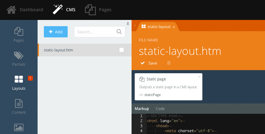
As we want to show static pages with the layout, we should add the Static Page component. Find it in the Components list in the sidebar and click. Save the layout.
Creating the static pages
Now that we have the the layout, we can create static pages. Click the Pages link in the OctoberCMS main menu. For this tutorial we used the following page structure:
- Home
- Projects
- Websites
- Applications
- About
- Contact Us
- Terms
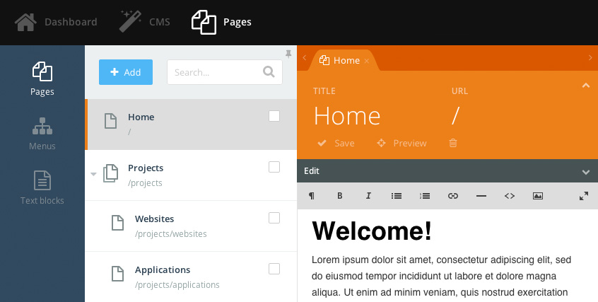
Let's create a static page for each item in our structure. Select pages, click the Add button and fill out the title field with the name of the page. The contents and URLs do not matter too much because the Static Pages plugin does its best to generate nice URLs, but for the Home page it makes sense to use the / (forward slash) URL.
You might ask why we needed to create the layout first, before the static pages. That's because static pages require a layout. There's the Layout dropdown, hidden by default on the Edit Page form, and you should select a layout for each page. When a layout already exists, the first available layout is selected by default.
Creating the menus
The site's top menu has two parts - the left part and the right part. Twitter Bootstrap markup requires two separate lists for the left and right parts. This means that we should create two menus.
Click the Menus tab in the Pages section and click the Add button to create the first menu. We want to create the left part of the top menu. Assign the name "Main menu - left" to the menu, just for clarity. Now it's time to create menu items for the menu. If we were boring, you would need to create an item for each individual page link. But we are not boring! In some cases the menus can generate their items automatically, and it is possible to do this when linking to static pages.
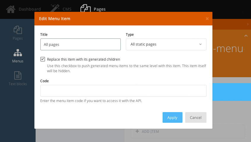
Click the Add Item link and define the menu item as follows. The title doesn't really mater for this item, you can enter "All pages", or anything else. Select the menu type as "All static pages", it means the menu item should expand to create links to all static pages defined on the website. And the "Replace this item with its generated children" checkbox should be checked because we don't want the "All pages" menu item to be displayed in the menu - we want it to be replaced with the actual links.
Save the menu item. Let's return to the Layout that we created before and add the menus to the page.
Adding the top menu - the left part
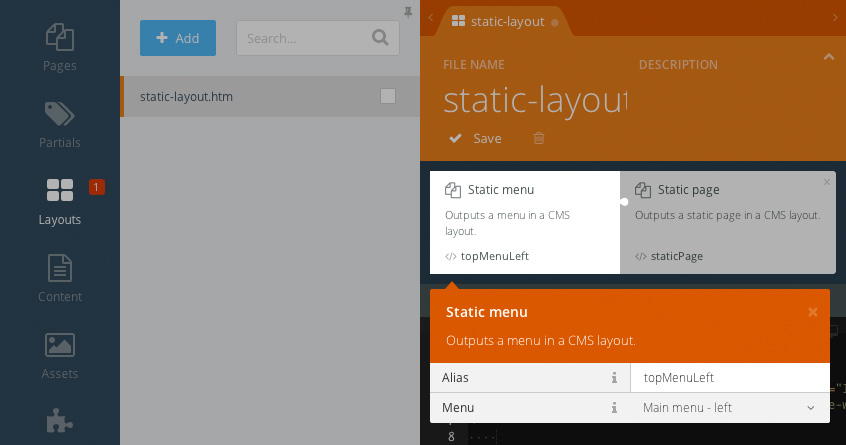
Go to the CMS section and open the layout we created earlier. Add the Static Menu component to the layout. Click the component and make sure that the "Main menu - left" item is selected in the Menu drop-down. Assign the component the topMenuLeft alias.
If the world was simpler, you would just use the component tag to render the menu, like this:
<div class="navbar-collapse collapse">
    {% component 'topMenuLeft' %}
</div>
But Bootstrap requires special CSS classes to be applied to the menu's Unordered List (UL) and List Item (LI) elements, whereas the default menus markup outputs simple nested UL lists without any Bootstrap classes. The solution is obvious - do not use the default component partial and create another partial that would generate the markup that Bootstrap expects.
Create a new partial in the CMS section and call it menu-items. Thanks to the Bootstrap's consistency we can use the same partial for all menus on the website, even for the sidebar category list. Hail to the standards!
Below is the partial code. By the way, if you take a look at the Pages plugin documentation you will find everything you need to know about variables generated by the staticMenu component.
<ul class="{{ class }}">
    {% for item in items %}
        <li
            class="{{ item.isActive or item.isChildActive ? 'active' : '' }}
            {{ item.items ? 'dropdown' : '' }}"
        >
            <a
                {% if item.items %}class="dropdown-toggle" data-toggle="dropdown"{% endif %}
                href="{{ item.url }}"
            >
                {{ item.title }}

                {% if item.items %}<span class="caret"></span>{% endif %}
            </a>

            {% if item.items %}
                {% partial 'menu-items' items=item.items class='dropdown-menu' %}
            {% endif %}
        </li>
    {% endfor %}
</ul>
The outer UL element has the class attribute which value we can pass to the partial from the outside. The items variable is passed from the outside as well. This makes the partial reusable. Other parts of the partial add the active class to the active menu items and enable the drop-down support for nested items. That's it.
Now that we can generate the markup required for the Bootstrap menus, we can return to the layout and use the partial. Find this part:
<div class="navbar-collapse collapse">
    <!--
        The menus will be here
    -->
</div>
And replace the comment with this code:
{% partial 'menu-items' items=topMenuLeft.menuItems class='nav navbar-nav' %}What does this code mean? It means - include the menu-items partial, assign the UL element class "nav navbar-nav" and use the menu items from the topMenuLeft component. Still looks complicated? Keep reading and you will see how cool this approach is!
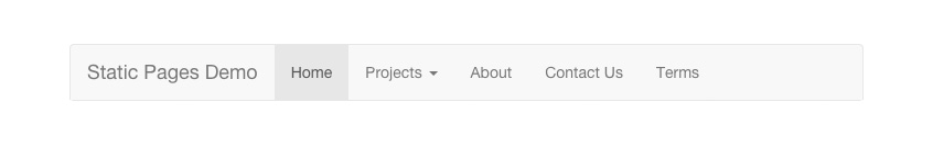
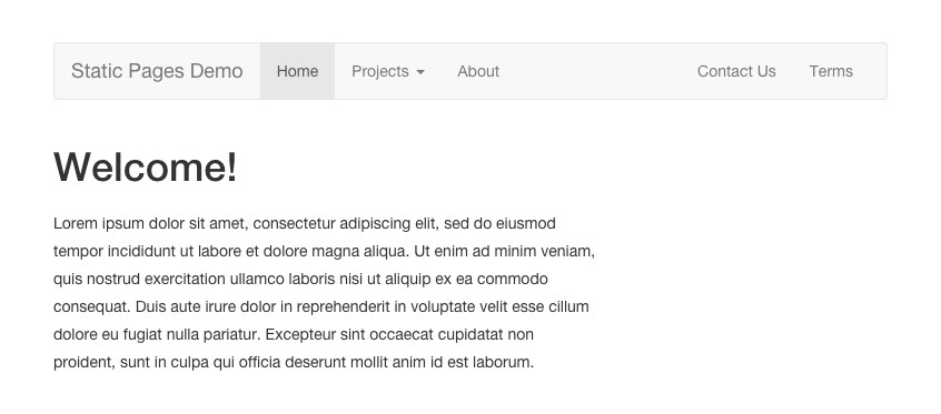
We're ready to test the front-end part of our theme. Open the website in another browser tab and take a look:
Adding the right part of the main menu
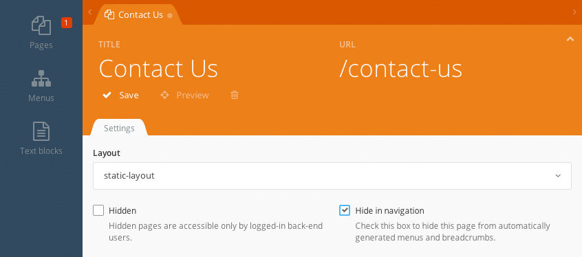
Did you notice that something is wrong with the menu? Well, it doesn't have the part on the right, but that's expected, we haven't implemented it yet. What's wrong is the Contact Us and Terms links are displayed in the left part. We don't want those items to be there, they should go to the right. That happened because the "All static pages" menu item we chose expands to show all static pages. But we can easily fix that. Go to the Pages section, click the Contact Us page, and check the "Hide in navigation" checkbox in the page's settings:
Refresh the front-end. Much better, the unwanted items have disappeared. Now let's create the right part of the menu.
Moving along, click the Menus tab and add a new menu. Call it "Main menu - right". This menu will include two just items - Contact Us and Terms. Click the Add Item link and enter the "Contact Us" title for the item. Use the "Static page" type this time. Select the Contact Us page from the Reference drop-down. Leave all the checkboxes unchecked.
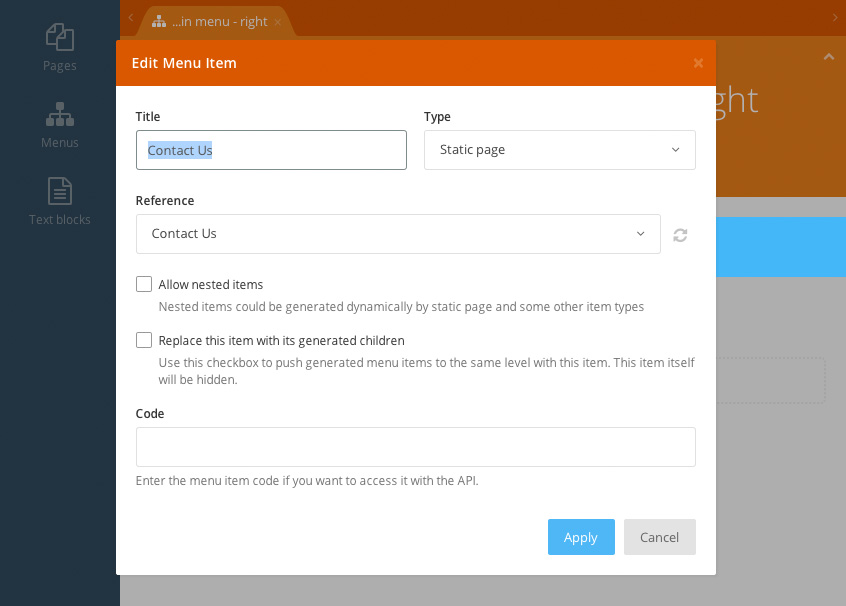
Notice that although the Contact Us page is marked as hidden in navigation, if a menu item points directly to it, it's still shown. This is because the "Hide in navigation" feature works only for automatically generated items. Save the Contact Us item and repeat the process for the Terms page link.
Now let's add the right part of the menu to the layout. Return to the Layout and add another Static Menu component. Assign it the topMenuRight alias and select the "Main menu - right" menu in the Menu drop-down. In the layout code, below the first menu partial tag add another partial tag, so that the entire section looks like this:
<div class="navbar-collapse collapse">
    {% partial 'menu-items' items=topMenuLeft.menuItems class='nav navbar-nav' %}
    {% partial 'menu-items' items=topMenuRight.menuItems class='nav navbar-nav navbar-right' %}
</div>
You see the difference? The first partial renders menu items of the topMenuLeft component and the second partial renders items of the topMenuRight component. Also, the second partial adds the navbar-right CSS class to the UL element. That's what Bootstrap expects.
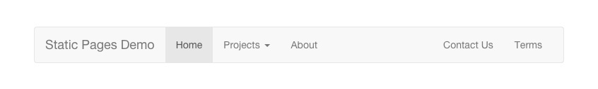
You can refresh the front-end page now and make sure that everything looks as expected now:
Adding the static page content
Perhaps you already noticed that the front-end pages do not display the static pages' content. We have added the Static Page component to the layout, but that's not enough - we should render it. Our layout has the section that looks like this:
<div class="col-sm-8">
    <!--
        We will place the page contents here
    -->
</div>
Replace the comment in the section with this:
{% page %}Refresh the front-end and make sure that the static pages are displayed with content now:
What about the blog?
For the next part we'll be adding the blog categories menu displayed in the sidebar. In this tutorial we're not going to explain how to build a blog with OctoberCMS. You can read about that in the Blog plugin documentation. We will only cover how to create the Blog Category page, which is required for the sidebar links.
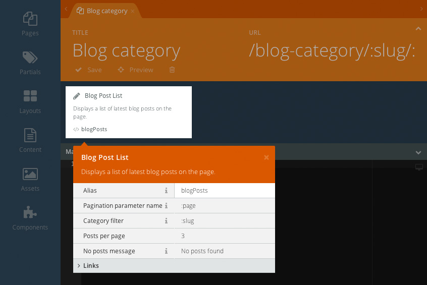
Create a new page in the CMS area and drag the Blog Post List component to the page's code area. Select the layout in the page's settings area. The page content should look like this:
{% component 'blogPosts' %}Click the component and enter :slug in the Category filter property. And finally paste this URL pattern to the URL field: /blog-category/:slug/:page?. Save the page.
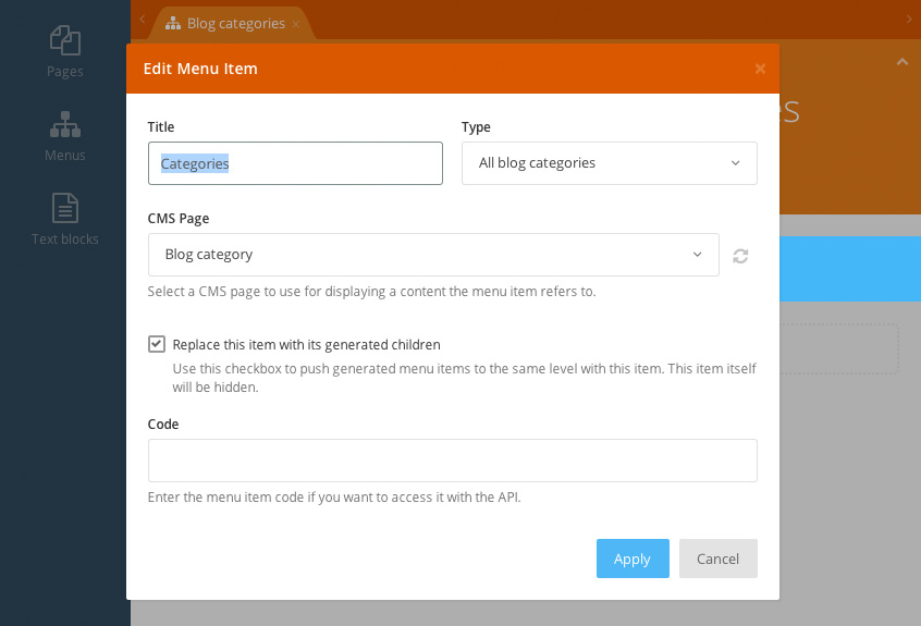
Now that we have the Blog Category page we can create the sidebar menu. Return to the Pages section and create a new menu. Call it "Blog categories". The menu should contain a single item with the assigned type "All blog categories", and it should replace the item with generated children. In the CMS Page drop-down menu select the blog category page you created before.
Save the menu and return to the Layout. Add yet another Static Menu component to the layout. Assign the alias blogCategoriesMenu to the component and select the "Blog categories" menu in the Menu drop-down. Find this part in the layout code:
<div class="sidebar">
    <!--
        The blog category list will be displayed here
    -->
</div>
Replace the comment with the partial tag:
<h4>Blog categories</h4>
{% partial 'menu-items' items=blogCategoriesMenu.menuItems class='nav nav-pills nav-stacked' %}
As you can see we use the same partial, but this time we render items of the blogCategoriesMenu component and we apply the "nav nav-pills nav-stacked" CSS class to the UL element. That's the way to generate a nice sidebar menu with Bootstrap.
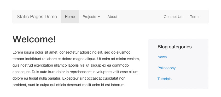
Refresh the front-end and make sure the sidebar now displays blog categories, and they even work! Of course, you should create some categories and blog posts first, otherwise you won't see anything interesting!
The last trick!
Are you still with us? That's great, because we're going to show you the last trick in this tutorial. We're talking about a way to mark a menu item active with the API. Imagine that you have a Blog menu item in the top menu and you want it to be active when you browse a blog category. Let's add this menu item first.
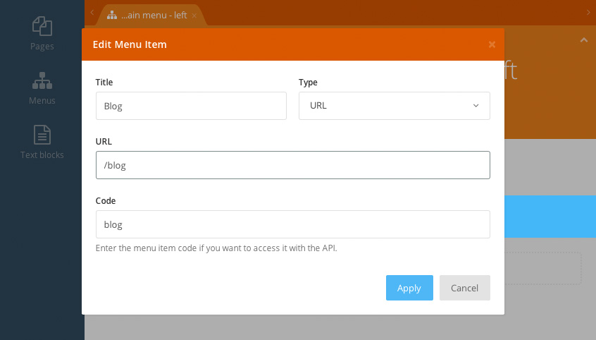
Return to the Pages section and click the "Main Menu - left" menu. Add a new item. Call it "Blog" and select the URL type in the drop-down. Enter the "/blog" URL in the URL field. This page doesnt't exist on the website, and we're not going to build it. We'll assume that you have this page if you develop a blog website.
To access the menu item with the API you should assign it a code. Enter the "blog" value to the Code field and save the menu.
Now return to the CMS section and open the Blog Category page. Go to the Code tab and paste this code snippet:
function onInit()
{
$this['activeMenuItem'] = 'blog';
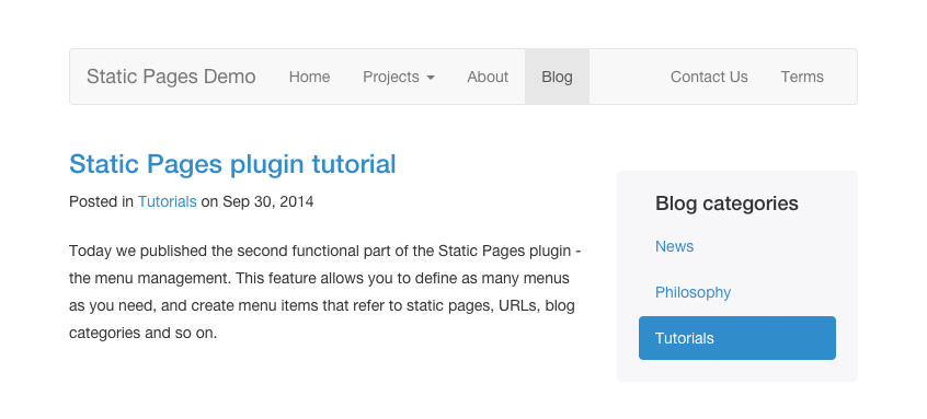
}This code sets the page's activeMenuItem variable which the Static Pages plugin reads when it decides which item is active. Now when you browse to a blog category the Blog menu item is active:
Conclusion
Think about it: writing this tutorial took several hours. Creating the demo theme took 15 minutes. Here's what we have in the CMS: one layout, mostly filled with Twitter Bootstrap markup, one page for the blog categories and one partial. Here's what we have for the client - a website with editable content, where new static pages and menu items can be added without any programming. We think that's not that bad!
You can download the theme used for the tutorial here: demo theme. You can clone the theme repository here.
The Static Pages plugin is still in the Beta status. The third, final, development phase will add powerful static content management features.
Thanks for reading!