Why the Global Leader in the Field of Air-Supported Structures Decided To Migrate to October CMS
Posted in Case Studies on Dec 07, 2021
Today we are talking to Blaž Oražem, IT engineer and technical director of the Slovenian digital studio Spletna postaja. They started working with October CMS back in 2016 and today October CMS is their primary platform for developing custom solutions for different clients.
One of their most interesting projects is the portfolio website for a company DUOL (duol.eu), which has been developed as an international platform in 17 different language versions. The first version of the project was published in 2018 and since then the website has been constantly evolving to this day. Many custom features have been added to the initial draft over the years of development and a few visual face-lifts were incorporated as well.
What is DUOL about?
Company DUOL has been active on the market since 1992, during which time DUOL has successfully acquired the position of one of the most significant suppliers of various fabric structures.
Their services and products cover everything from engineering, production, installation of sports halls in the form of air-supported structures, to the manufacture and assembly of sports floors, sports equipment, construction of sports stadiums, indoor football fields, indoor golf courses and other similar products.
DUOL offers a full service, including initial consultation, design, production, groundworks, dome installation and maintenance services.
Increased global presence of the company was the reason why they decided to completely renovate their website – technologically and visually.
What are special features of the project?
- Modern design with cross-browser and multi-platform support.
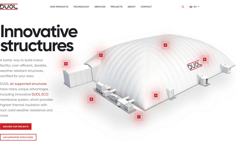
- Promo hero on the homepage with animated hotspots – clicking on an individual hotspot reveals interesting information about the selected element of the main product – the air dome.
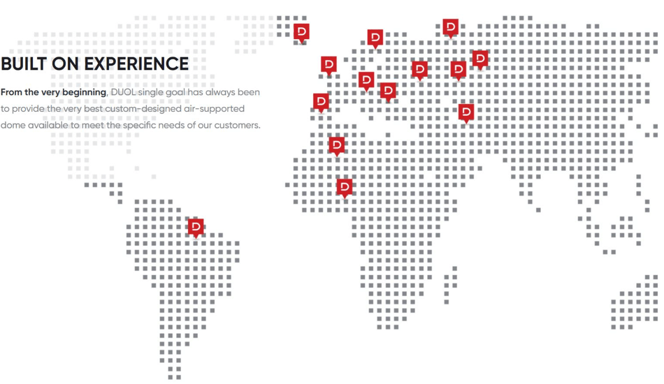
- The website is supported by 17 language versions, including Arabic, which is RTL (right-to-left), making it necessary to mirror the entire design.
- The Product inquiry configurator allows customers to easily send their specific request to DUOL and receive their initial offer much faster than by typing numerous emails and making extensive phone calls.
- Interactive display of references with three different view modes and additional filtration, with which the user can filter the most interesting reference projects.
- "Trusted by prominent clients" section on the homepage with an interesting CSS feature: exposed emblems change randomly and gain color with mouse-over effect.
- Contact page with an interactive map of local offices around the globe.
- Partner login section where DUOL partners can access confidential information and documentation intended only for their eyes.
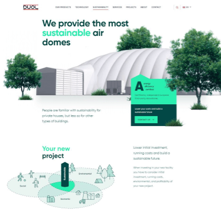
- Sustainability landing page, which is highly animated and full of interesting content about the energy efficiency of their projects.
- Page search that is customized and also crawls for references in detail.
Are there any other pages you would highlight and for what reason?
- Custom landing pages, such as:
- Services with integrated video presentation.
- Technology with two images supported by hotspots representing the view from the outside and the view from the inside.
- About us due to interesting design features and client statements.
- Custom product pages, such as Football Air Dome:
- View from the inside and from the outside
- Images with 360 ° panoramic view
- Video content
- Photo gallery
- Related references to the current topic
- News and other information related to the current topic of the product page
- Sustainability landing page, which was a special upgrade and was just recently published:
- Page is heavily animated with CSS and Javascript
- Lazy-loading elements are used all across the page, so that the loading time is as efficient as possible
- Content is interactive and easy to browse
- RWD (responsive web design) is very refined so that mobile users can also get the full experience of the content
How does the product inquiry configurator work?
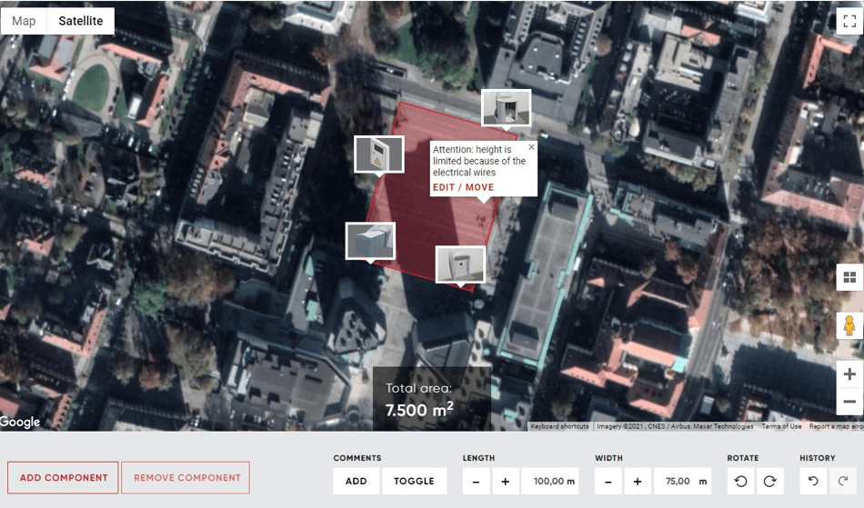
DUOL’s desire was to somehow gain more information about their client’s project in the first step of the contact. We integrated one of Google's tools (Maps) and adapted it to the design and needs of users. With the help of the configuration tool, DUOL clients can create a conceptual sketch of a product (e.g. air-dome) placed at a specific location and send an inquiry via an online form or even save a draft for later manipulation if they are not sure about everything yet.
The initial screen opens Google Maps in default satellite view mode, and you can place a working canvas anywhere on the map. There’s even a street view mode where it’s available to see the location in person. The placed canvas can be of any size (length and width can be set in meters), and it is also possible to rotate the canvas on the map.
When the canvas is fully set, you can add components to the panel, such as a revolving door, a vehicle and equipment airlock door, a ventilation and heating system, an access door, an emergency door, and an electrical connection panel. You can place additional comments anywhere on the sketch to help clarify important information.
As already mentioned, you can save the sketch as a draft and it is available for later manipulations or you can send it immediately to DUOL via a custom form.
DUOL can view all completed sketches as well as all saved drafts on the October CMS admin control panel and get acquainted with the situation and customer wishes.
A custom plugin has been developed to support this unique feature. The plugin covers both parts - the front-end screen of the configurator, where the integration of Google tools is established, and the back-end screen, where completed projects and saved drafts are displayed in a table with a single-view mode for each of the projects.
The product inquiry configurator can be found at https://duol.eu/configurator.
What did you want to achieve with the interactive display of references?
DUOL projects are highly customized and we have tried to offer their clients an elegant and simple solution to get acquainted with all the possibilities offered by DUOL.
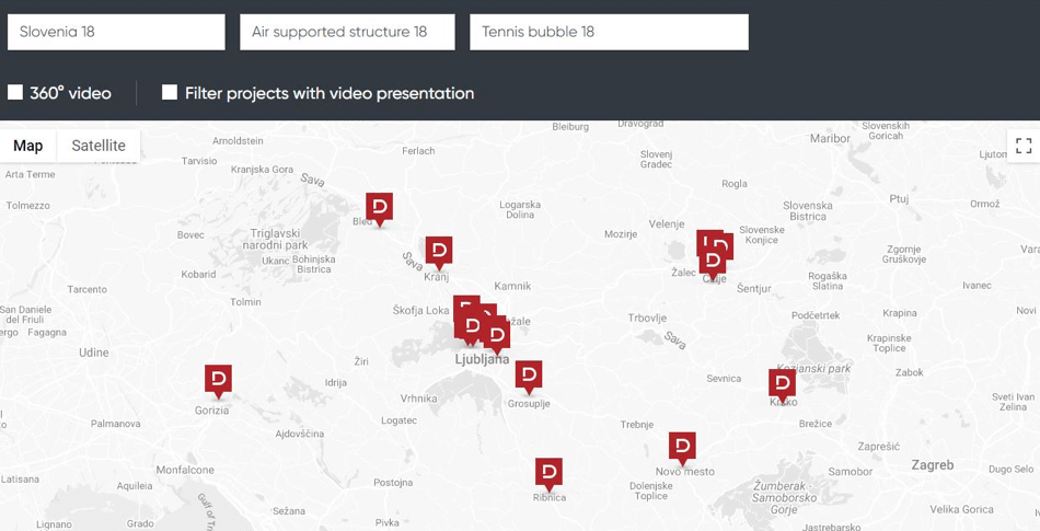
The initial display is a well-known way to view Google Maps with the hotspots of all projects. Clicking on a single hotspot opens a tooltip that displays a photo of the project along with the title, location, and “read more” link that follows the selected reference landing page.
The user can also choose one of the other two display modes - list or gallery. The reference list is a simple table that allows you to sort by year of construction, country, city, title, type of structure, application and size. In gallery mode, all presented projects are displayed with their primary image and some basic information, and the full reference can of course be clicked.
Above the selected view is also filtering, which allows the user to filter the displayed references by country, type of structure and type of application. Additional checkboxes have been added to filter 360 ° video references and projects with a video presentation.
To support this feature, we have developed a custom plugin that allows DUOL to manage references through the admin control panel in the October CMS. DUOL has full access to add new references, delete obsolete and modify existing ones, and edit data for each project.
DUOL references can be found at https://duol.eu/some-best-references.
What’s so special about a contact page?
At first glance, it doesn’t seem unusual - at the top of the page is a basic contact form along with some information about the company and its whereabouts – a fairly standard example of a quick contact with a customer.
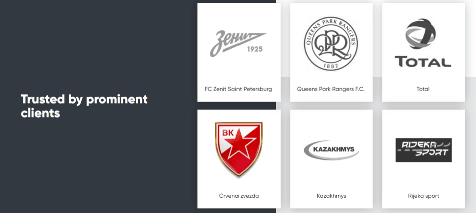
As soon as you scroll down, an interactive map will appear containing hotspots in all countries where DUOL offices are present. The user can click on any hotspot and is immediately presented with the details of the local office along with another contact form.
This contact form contains elements similar to the general form, but with the difference that the e-mail with its content is sent directly to the e-mail address of the selected state office.
The contact landing page can be found at https://duol.eu/contact
There is also a partner login section?
Yes, DUOL is able to manage special section in the CMS, where they can edit confidential data and upload documents that are not intended for the general public. They can create users and grant them access to this area of the website.
What are your plans for the future in terms of the DUOL website?
In the future, we are pretty confident that we will add some additional languages to the website, perhaps expand the Partner Login section a bit, and work on other interesting requirements that the client will provide. We are constantly working with the client on new ideas and we all agree that every few years a style change is needed to keep the site modern and up to date. We look forward to working with DUOL on their mirror to the world.
Could you share any feedback from your team members?
Our team is happy with October CMS! Here are some quotes from our Head of Marketing and Front-end Developer:
October CMS has proven to be a robust and modern system that offers highly customized and state-of-the-art functionalities. Every aspect of our unique demand (features and design) has been perfectly incorporated into the CMS and everything works well for us: it’s fast, easy and secure. Most importantly, the website has improved our business and market position and continues to follow our business growth. In terms of Google Analytics metrics, the new website is a complete success: the number of new users increased by + 320%, the number of pages / session by 62%, the average duration by + 120% and the bounce rate decreased by 25%.
Igor Tarlanovič, Head of Marketing, DUOL d.o.o.
From the developer's point of view, the work on the DUOL project and the use of the October CMS is really remarkable, as it allows a lot of flexibility and customization. Heavy elements are easy to build and customize, making it easier for the front-end programmer to implement the design and function of custom page elements. As such, it was a very convenient tool for any challenging task, design element, or any other professional challenge I encountered during the construction of the DUOL project. The result is an exceptional website with a fully integrated and functional design.
Matic Bratina, front-end developer.
We are always happy learning and sharing stories of October CMS users on our blog. Please don’t hesitate to contact us if you have a story.