

Plugin component displays share buttons
Social Networks and Messengers:
- VK
- Odnoklassniki
- Telegram
- Viber
Features
- easy setup
- SVG icons are used for buttons, so there are no dependencies on icon fonts
- no external links
- there is no interaction with database
- optimized javascript file less than 1 Kb
- without jQuery
Button Style
Silver

Color

With text


Installation via Command Line
php artisan plugin:install WebVPF.Share
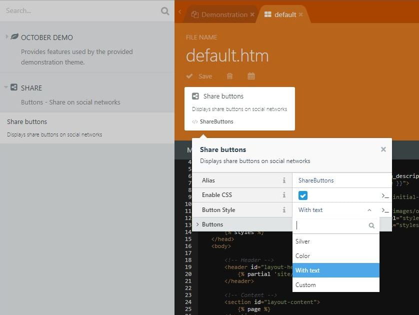
Simple settings are available in the component settings.
Selecting and Sorting Buttons
Specify the id of the buttons that you want to display, separated by commas (fb, tw, vk, ok, in, tg, vb, wa)

In this case, you can specify the order in which the buttons will be displayed.
You can do a similar layout:
<div>Share: {% component 'ShareButtons' %}</div>
or
<div class="container">
    <h3>Share</h3>
    <div>{% component 'ShareButtons' %}</div>
</div>
Button Style
Silver
Color
With text
Simple settings are available in the component settings.
Custom CSS
Create file share-custom.css and place it in folder plugins/webvpf/share/assets/css/. In component settings, select Custom item for Button Style.
Disable css
You can completely disable predefined css in component settings. Styles can be placed in css themes or wherever convenient for you.
Paste buttons
If you work with code, you can insert buttons as follows:
[ShareButtons]
btns = "fb, tw, vk, ok, in, tg, vb, wa"
css = 1
skin = "text"
==
{% component 'ShareButtons' %}
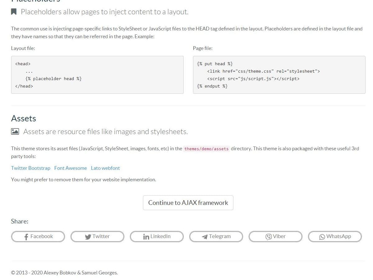
Buttons:
fb- Facebookin- LinkedInok- Odnoklassnikitg- Telegramtw- Twittervb- Vibervk- VKwa- WhatsApp
CSS:
- 1 - enable
- 0 - disable
Skins:
silvercolortextcustom
Disable CSS in code
set 0 for css:
[ShareButtons]
btns = "fb, tw, in, tg, vb, wa"
css = 0
==
{% component 'ShareButtons' %}
-

Alessio
Found the plugin useful on 18 Jun, 2020
Straight to the point! Just perfect Thanks
-

| 1.1.3 |
Delete file UPGRADE.md Apr 03, 2021 |
|---|---|
| 1.1.2 |
Improving component code Mar 30, 2021 |
| 1.1.1 |
!!! Component settings have changed. Indicate in the properties of the ID buttons that you want to display. You can set the order of the buttons. Mar 30, 2021 |
| 1.0.4 |
Removed xmlns attributes from svg icons Mar 29, 2021 |
| 1.0.3 |
Added charset in CSS file for style with text Jul 12, 2020 |
| 1.0.2 |
By default all buttons are disabled. Code Improvement Feb 25, 2020 |
| 1.0.1 |
First version of Share Feb 24, 2020 |
Update 1.1.1
The settings for the component that displays the Share buttons have changed.
Immediately after the upgrade, do the following:
- In the component settings for the Buttons item, specify the IDs of the buttons that you want to display, separated by commas:
However, you can set the order of the buttons. The order in which the button identifiers are listed, in that order they will be displayed.
Example: fb, tw, vk, ok, in, tg, vb, wa
fb- Facebookin- LinkedInok- Odnoklassnikitg- Telegramtw- Twittervb- Vibervk- VKwa- WhatsApp
Обновление 1.1.1
Изменились настройки у компонента который выводит кнопки Поделиться.
Сразу после обновления сделайте следующее:
- В настройках компонента для пункта Кнопки укажите через запятую ID тех кнопок которые вы хотите отобразить.
При этом вы можете задать порядок кнопок. В каком порядке будут указаны идентификаторы кнопок, в таком порядке они будут отображаться.
Пример: fb, tw, vk, ok, in, tg, vb, wa