
Partial Playground Plugin for October CMS
Partial Playground is a backend plugin for October CMS that allows you to test and preview your partials with dynamic parameters directly from the administration interface. It helps streamline the development and fine-tuning of reusable components.
Main Features
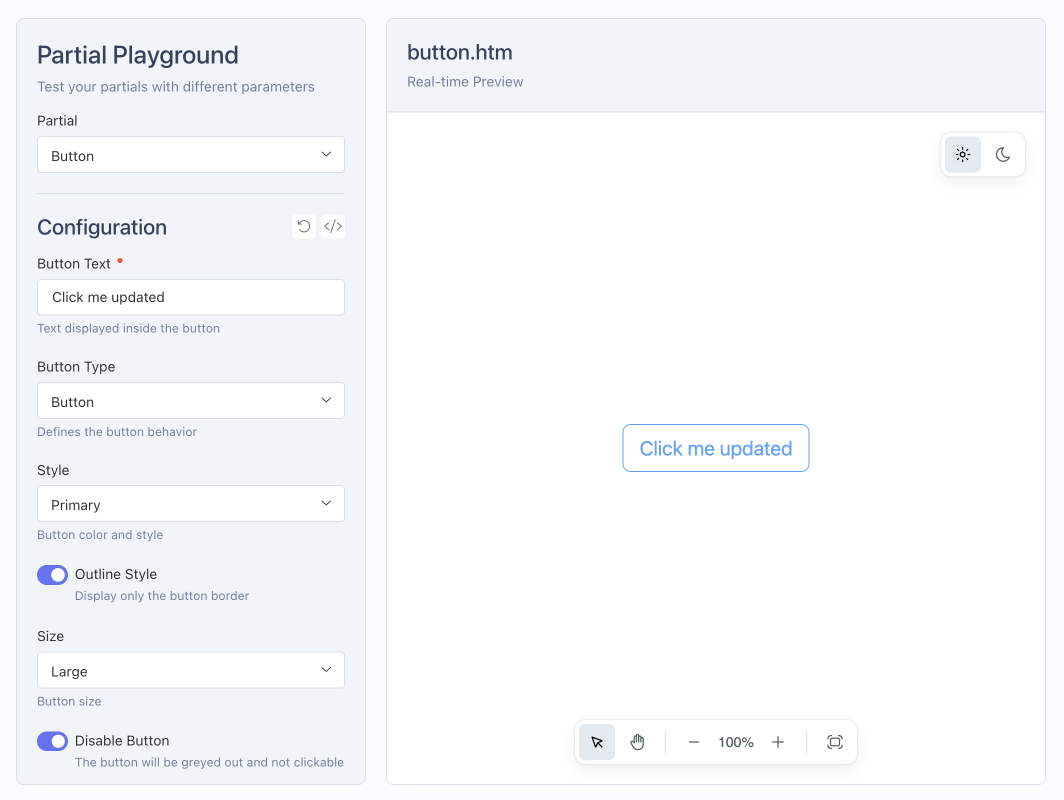
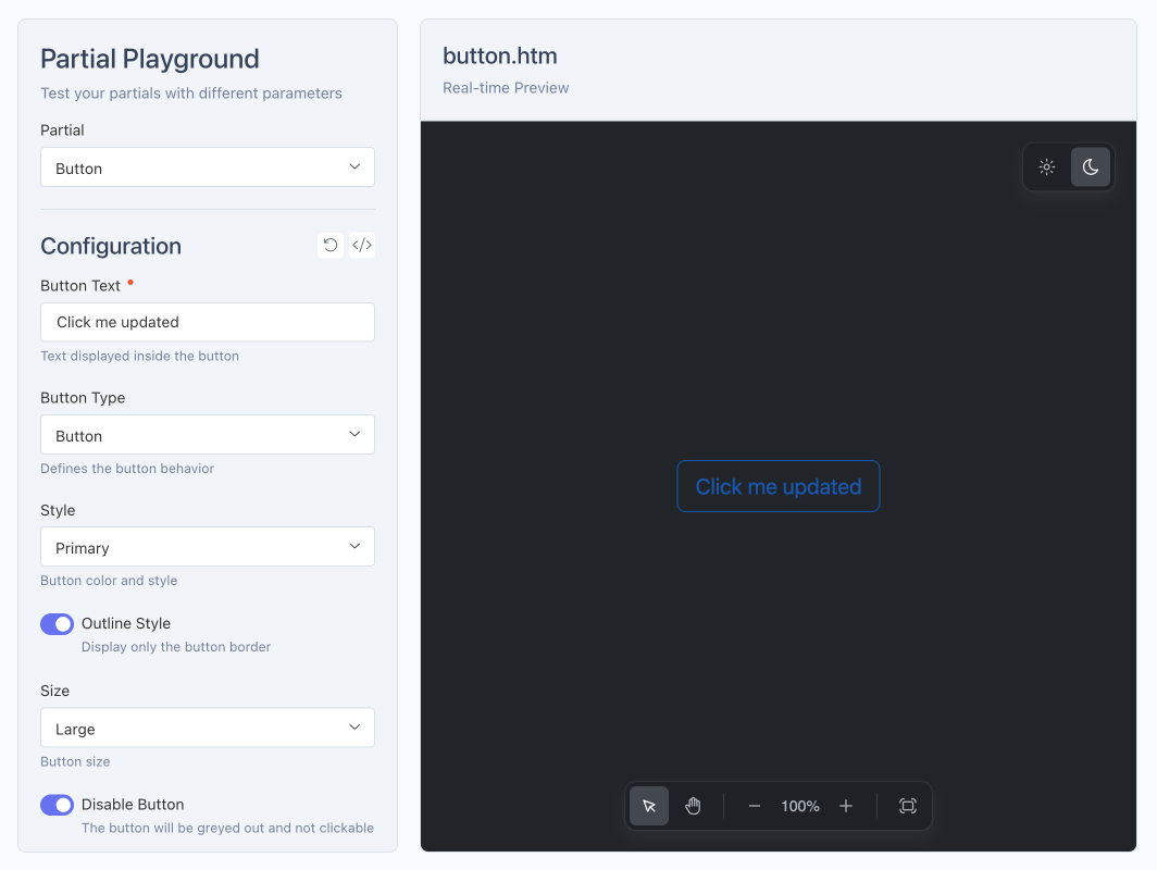
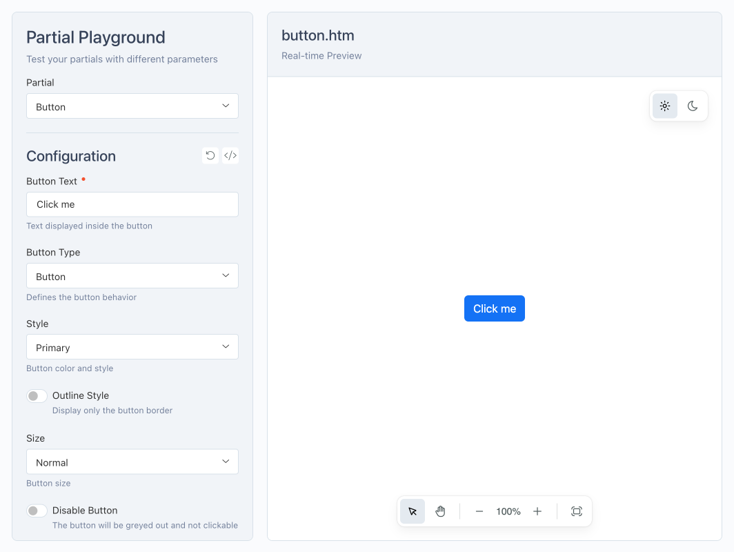
- Real-time preview: instantly see the effect of changes on your partials.
- CSS and JS file management: easily include and test styles and scripts specific to each partial.
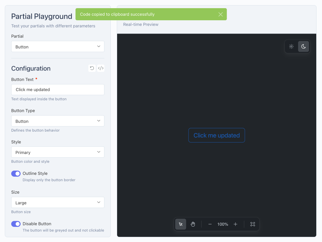
- Copy generated code: quickly get the code ready to be used in your pages or templates.
- Intuitive interface: modify dynamic parameters and observe the final rendering instantly.
Documentation
For installation, configuration, and usage examples, please refer to the Documentation tab.
Installation via Command Line
php artisan plugin:install Ducharme.PartialPlayground
Partial Playground Plugin for October CMS
Installation
You can install this plugin from the October CMS Marketplace or using Composer.
Via Marketplace
- Go to the October CMS backend: Settings > System > Plugins.
- Search for the Partial Playground plugin.
- Click on the plugin to install it.
Via Composer
Open your terminal, navigate to the root of your October CMS project, and run:
php artisan plugin:install Ducharme.PartialPlayground
Configuration
The Partial Playground plugin offers two levels of configuration: global and specific to each partial.
1. Global Plugin Configuration
The global configuration of Partial Playground can be customized in your project.
Copy the plugins/ducharme/partialplayground/config/config.php file to the config/ducharme/partialplayground.php folder and modify the values as needed.
partials_folder: folder where your partials are stored, relative to the theme’spartials/directory.preview_css_file: global CSS file applied to all previews.preview_js_file: global JS file applied to all previews.preview_layout: default layout for previews (contentorfull).preview_default_theme: default theme (light,dark, orauto).preview_theme: configuration for applying the theme (target,type,name,value).
2. Partial-Specific Configuration
Each partial must have two files at the same level in the partial’s folder:
a) File .htm
- Contains the HTML code of your partial.
- Must be well-isolated, like a true reusable component.
- Includes only the markup required for the partial, without external dependencies unmanaged by the plugin.
b) File .yaml
- Defines the dynamic fields and configurable settings for the partial.
- Allows specifying a CSS and JS file specific to the partial, in addition to the globally configured ones:
preview_css_file: relative path to a CSS file specific to the partial (optional).preview_js_file: relative path to a JS file specific to the partial (optional).
- Allows defining the preview layout specific to the partial (
contentorfull) via:preview_layout: overrides the global layout if needed.
3. Available Field Types for .yaml
Here are all the field types you can use in your YAML files to configure a partial:
TextNumberCheckboxSwitchRadioTextareaDropdownDate PickerColor PickerCode EditorRich EditorMedia FinderHint
For more details about each field type and available options, see the official documentation: Form Fields – October CMS
Examples
Alert
{# alert.htm #}

{# --- Import Bootstrap 5.3 --- #}
<link href="https://cdn.jsdelivr.net/npm/bootstrap@5.3.2/dist/css/bootstrap.min.css" rel="stylesheet" crossorigin="anonymous">
<script src="https://cdn.jsdelivr.net/npm/bootstrap@5.3.2/dist/js/bootstrap.bundle.min.js" crossorigin="anonymous"></script>

{# --- Dynamic parameters --- #}
{% set type = type ?: 'info' %}
{% set message = message ?: 'Ceci est une alerte.' %}
{% set dismissible = dismissible ? 'alert-dismissible' : '' %}

{# --- Alert --- #}
<div class="alert alert-{{ type }} {{ dismissible }}" role="alert">
    {% if dismissible %}
        <button type="button" class="btn-close" data-bs-dismiss="alert" aria-label="Close"></button>
    {% endif %}
    {{ message }}
</div>
{# alert.yaml #}

fields:

  type:
    label: "Alert Type"
    type: dropdown
    default: info
    options:
      primary: Primary
      secondary: Secondary
      success: Success
      danger: Danger
      warning: Warning
      info: Info
      light: Light
      dark: Dark
    comment: "Defines the style of the alert"

  message:
    label: "Message"
    type: textarea
    default: "This is an alert."
    comment: "The text to display inside the alert"

  dismissible:
    label: "Show close button"
    type: switch
    default: 1
    comment: "Allows the user to close the alert"

preview_layout: "full"
Button
{# button.htm #}

{# --- Import Bootstrap 5.3 --- #}
<link href="https://cdn.jsdelivr.net/npm/bootstrap@5.3.2/dist/css/bootstrap.min.css" rel="stylesheet" crossorigin="anonymous">
<script src="https://cdn.jsdelivr.net/npm/bootstrap@5.3.2/dist/js/bootstrap.bundle.min.js" crossorigin="anonymous"></script>

{# --- Dynamic parameters --- #}
{% set text = text ?: 'Click me' %}
{% set type = type ?: 'button' %}
{% set style = style ?: 'primary' %}
{% set outline = outline ? 'btn-outline-' ~ style : 'btn-' ~ style %}
{% set size = size ?: '' %}
{% set disabled = disabled ? 'disabled' : '' %}

{# --- Button or link --- #}
{% if type == 'link' and href %}
    <a href="{{ href }}" class="btn {{ outline }} {{ size ? 'btn-' ~ size : '' }} {{ disabled }}">
        {{ text }}
    </a>
{% else %}
    <button type="{{ type }}" class="btn {{ outline }} {{ size ? 'btn-' ~ size : '' }}" {{ disabled }}>
        {{ text }}
    </button>
{% endif %}
{# button.yaml #}

fields:

  text:
    label: "Button Text"
    type: text
    default: "Click me"
    comment: "Text displayed inside the button"
    placeholder: "Ex: Submit"
    required: true

  type:
    label: "Button Type"
    type: dropdown
    default: button
    options:
      button: Button
      submit: Submit
      reset: Reset
      link: Link
    comment: "Defines the button behavior"

  href:
    label: "Link URL"
    type: text
    default: "#"
    comment: "The URL the button points to if type is 'Link'"
    trigger:
      action: show
      field: type
      condition: value[link]

  style:
    label: "Style"
    type: dropdown
    default: primary
    options:
      primary: Primary
      secondary: Secondary
      success: Success
      danger: Danger
      warning: Warning
      info: Info
      light: Light
      dark: Dark
      link: Link
    comment: "Button color and style"

  outline:
    label: "Outline Style"
    type: switch
    default: 0
    comment: "Display only the button border"

  size:
    label: "Size"
    type: dropdown
    default: ''
    options:
      '': Normal
      sm: Small
      lg: Large
    comment: "Button size"

  disabled:
    label: "Disable Button"
    type: switch
    default: 0
    comment: "The button will be greyed out and not clickable"
Toggle switch
{# toggle-switch.htm {#

{# --- Toggle switch --- #}
<button id="toggle-switch-button"
        class="toggle-switch-btn"
        data-label="{{ label|default('OFF') }}"
        data-active-label="{{ active_label|default('ON') }}">
    {{ label|default('OFF') }}
</button>
{# toggle-switch.yaml #}

fields:

  note:
    type: "hint"
    comment: "This partial uses its own CSS and JS files as defined by the <code>preview_css_file</code> and <code>preview_js_file</code> keys in the partial's configuration."
    commentHtml: true

  label:
    label: "Toggle Label"
    type: text
    default: "OFF"
    comment: "Text initially displayed on the button"

  active_label:
    label: "Active Label"
    type: text
    default: "ON"
    comment: "Text displayed when the toggle is activated"

preview_css_file: "assets/css/toggle-switch.css"
preview_js_file: "assets/js/toggle-switch.js"
More examples are available in the plugin's examples folder.
Contributing
Contributions are welcome!
- Fork the project and create a branch for your improvements or fixes.
- Submit a Pull Request with a clear description of your changes.
- Report bugs or issues via Issues.
Please follow best practices and document your changes.
License
This plugin is released under the MIT License. The full text of the MIT License is available here: MIT License
Documentation
This documentation was partly generated with the help of an AI. The French version of this README is available here: README.fr.md
-
This plugin has not been reviewed yet.
-
| 1.0.0 |
Initial version of Partial Playground plugin Aug 28, 2025 |
|---|