
Color Tools Plugin for October CMS
Color Tools is a plugin for October CMS that provides advanced tools for managing and manipulating colours. It features an enhanced ColorPicker FormWidget with WCAG contrast validation, as well as a comprehensive library of Twig filters and functions for converting, analysing, and manipulating colours directly in your templates.
Key Features
- AdvancedColorPicker FormWidget: extension of the native ColorPicker with automatic WCAG contrast validation
- Twig conversion filters: conversion between hex, RGB, RGBA, and HSL formats
- Twig analysis filters: luminance calculation, contrast ratio, and best text colour detection
- Advanced Twig functions: colour mixing, alpha composition, WCAG validation, and random generation
- Intuitive interface: visual badges and real-time contrast indicators
Documentation
For installation, configuration, and usage examples, please refer to the Documentation tab.
Installation via Command Line
php artisan plugin:install Ducharme.ColorTools
Color Tools Plugin for October CMS
Installation
You can install this plugin from the October CMS Marketplace or by using Composer.
Via Marketplace
- Go to the October CMS backend: Settings > System > Plugins.
- Search for the Color Tools plugin.
- Click on the plugin to install it.
Via Composer
Open your terminal, navigate to the root of your October CMS project, and run the following command:
php artisan plugin:install Ducharme.ColorTools
Usage
The Color Tools plugin offers two main features: an advanced FormWidget for the backend and a collection of Twig filters/functions for the frontend.
1. AdvancedColorPicker FormWidget
The AdvancedColorPicker FormWidget extends October CMS's native ColorPicker by adding automatic contrast validation according to WCAG 2.0 standards.
Available Options
The widget inherits all options from the native ColorPicker and adds the following options:
| Option | Type | Description | Default |
|---|---|---|---|
role |
String | Colour role: foreground (text) or background (background) |
- |
compareTo |
String | Fixed comparison colour (e.g., #ffffff) |
- |
contrastWith |
String | Name of the field to dynamically compare with | - |
contrastLevel |
String | WCAG level: AA or AAA |
AA |
contrastSize |
String | Element size: normal, large, or ui |
normal |
contrastRequired |
Boolean | Blocks saving if contrast is insufficient | false |
Important Notes:
- The comparative field (
contrastWith) can be associated with a field of typecolorpickeroradvancedcolorpicker - For
foregroundcolours with alpha: contrast is calculated by composing the colour onto the background - For
backgroundcolours with alpha: contrast is calculated by ignoring transparency (as if the colour were opaque)
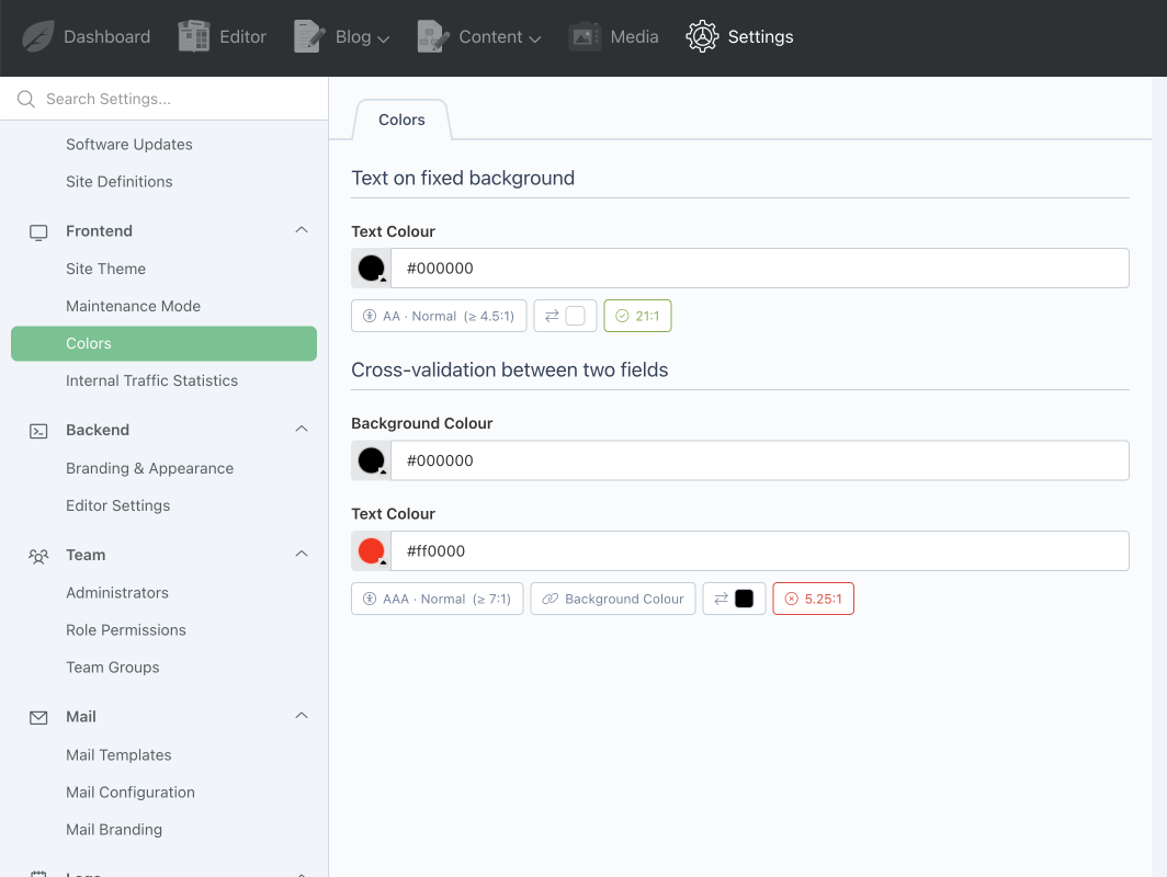
Visual Interface
The FormWidget displays informative badges in real-time:
- Badge Level + Size: WCAG level (AA/AAA) and size (normal/large/ui) with target ratio
- Linked field badge: name of the comparison field (clickable)
- Compared colour badge: visual preview of the comparison colour
- Status badge: contrast compliance with current ratio
Usage Examples
# Text on fixed background
text_color:
    label: "Text Colour"
    type: advancedcolorpicker
    role: foreground
    compareTo: '#ffffff'
    contrastLevel: AA
    contrastRequired: true

# Cross-validation between two fields
background_color:
    label: "Background Colour"
    type: colorpicker

text_color:
    label: "Text Colour"
    type: advancedcolorpicker
    role: foreground
    contrastWith: background_color
    contrastLevel: AAA
    contrastRequired: true
2. Twig Filters and Functions
The plugin automatically registers Twig filters and functions to manipulate colours in your templates.
Available Filters
| Filter | Syntax | Return | Description |
|---|---|---|---|
to_hex |
{{ colour|to_hex }} |
String | Converts to hexadecimal (#rrggbb) |
to_rgb |
{{ colour|to_rgb }} |
String | Converts to RGB (rgb(r, g, b)) |
to_rgba |
{{ colour|to_rgba(alpha?) }} |
String | Converts to RGBA. If alpha omitted, preserves original alpha |
to_hsl |
{{ colour|to_hsl }} |
String | Converts to HSL (hsl(h, s%, l%)) |
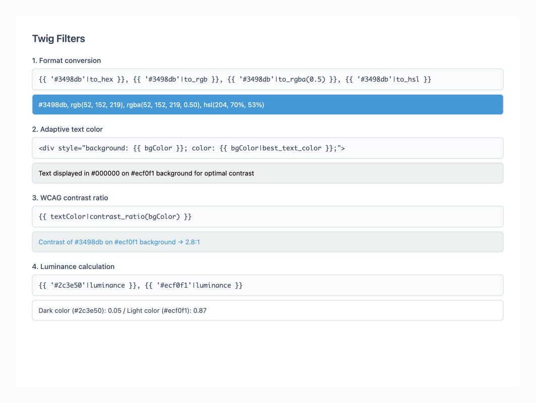
luminance |
{{ colour|luminance }} |
Float | Returns relative luminance (0.0 to 1.0) |
contrast_ratio |
{{ fg|contrast_ratio(bg) }} |
Float | WCAG contrast ratio (1.0 to 21.0) |
best_text_color |
{{ bg|best_text_color(underlying?) }} |
String | Returns #000000 or #ffffff. underlying default: #ffffff |
Available Functions
| Function | Syntax | Return | Description |
|---|---|---|---|
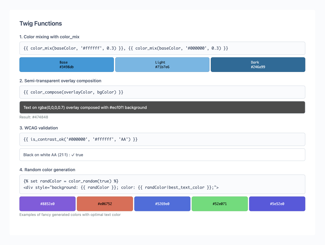
color_mix |
{{ color_mix(c1, c2, ratio?) }} |
String | Mixes two colours. ratio default: 0.5 (0=c1, 1=c2) |
color_compose |
{{ color_compose(fg, bg) }} |
String | Composes a colour with alpha onto a background |
is_contrast_ok |
{{ is_contrast_ok(fg, bg, level?, size?) }} |
Boolean | Verifies WCAG compliance. Defaults: level='AA', size='normal' |
color_random |
{{ color_random(fancy?) }} |
String | Generates a colour. fancy=true gives a vibrant balanced colour |
Usage Examples
{# Format conversions #}
{{ 'rgb(255,0,0)'|to_hex }}           {# #ff0000 #}
{{ '#3498db'|to_rgba(0.7) }}          {# rgba(52, 152, 219, 0.70) #}
{{ 'rgba(255, 0, 0, 0.5)'|to_rgba }}  {# rgba(255, 0, 0, 0.50) - preserves alpha #}

{# Adaptive text based on background #}
{% set bgColor = settings.background_color %}
<div style="background: {{ bgColor }}; color: {{ bgColor|best_text_color }};">
    Text with optimal contrast
</div>

{# WCAG validation with conditional display #}
{% set ratio = textColor|contrast_ratio(bgColor) %}
{% if is_contrast_ok(textColor, bgColor, 'AA') %}
    <p style="color: {{ textColor }}; background: {{ bgColor }};">
        Compliant contrast ({{ ratio }}:1)
    </p>
{% else %}
    <div class="alert alert-warning">
        Insufficient contrast: {{ ratio }}:1 (AA minimum: 4.5:1)
    </div>
{% endif %}

{# Colour palette generation #}
{% set baseColor = '#3498db' %}
<div class="palette">
    <div style="background: {{ baseColor }}">Base colour</div>
    <div style="background: {{ color_mix(baseColor, '#ffffff', 0.3) }}">Light shade</div>
    <div style="background: {{ color_mix(baseColor, '#000000', 0.3) }}">Dark shade</div>
</div>

{# Semi-transparent overlay composition #}
{% set overlayColor = 'rgba(0, 0, 0, 0.7)' %}
{% set underlyingBg = '#ffffff' %}
{% set composedColor = color_compose(overlayColor, underlyingBg) %}
<div class="overlay" style="background: {{ overlayColor }}; color: {{ composedColor|best_text_color }};">
    Overlay with optimal text
</div>
3. WCAG Standards
The plugin respects WCAG 2.0 guidelines for accessibility:
| Level | Size | Minimum Ratio |
|---|---|---|
| AA | Normal (< 24px) | 4.5:1 |
| AA | Large (≥ 24px) | 3.0:1 |
| AA | UI (icons, borders) | 3.0:1 |
| AAA | Normal (< 24px) | 7.0:1 |
| AAA | Large (≥ 24px) | 4.5:1 |
| AAA | UI (icons, borders) | 3.0:1 |
Note: Pixel sizes are provided as a guide, in accordance with the WCAG equivalence (18 pt ≈ 24 px).
Contributing
Contributions are welcome!
- Fork the project and create your branch for improvements or corrections.
- Make sure the tests pass before submitting your Pull Request:
vendor/bin/phpunit plugins/ducharme/colortools/tests - Submit a Pull Request with a clear description of the changes.
- Report bugs or issues via Issues.
Please respect good contribution practices and document your modifications.
Licence
This plugin is distributed under the MIT licence.
The full text of the MIT licence is available here: MIT License
Documentation
This documentation was generated in part with the assistance of artificial intelligence.
The French version of this README is available here: README.fr.md
-
This plugin has not been reviewed yet.
-
| 1.0.1 |
Fix colorpicker change detection using October core events Jan 04, 2026 |
|---|---|
| 1.0.0 |
Initial version of Color Tools plugin Dec 23, 2025 |