
Features:
- Easy to use.
- Quick Setup.
- Frontend Sortings with different parameters.
- Responsive design.
- Flexibility in Displaying.
- Full screen support
- Touch and support for mobile devices
- Zoom animation
- Social sharing
- Keyboard access
Usage:
This plugin can be used to include PhotoSwipe Gallery on your web pages with custom display options and animations.
- Credit: PhotoSwipe


Installation via Command Line
php artisan plugin:install ChiragPatel.PhotoSwipe
How to install:
To install this plugin you have to type ChiragPatel.PhotoSwipe in Backend System Settings > Updates & Plugins > Install plugins.
How to use:
In backend, Click on ‘Photo Swipe’ icon where you can manage your galleries.
Here three components are attached, you can use as per your requirement:
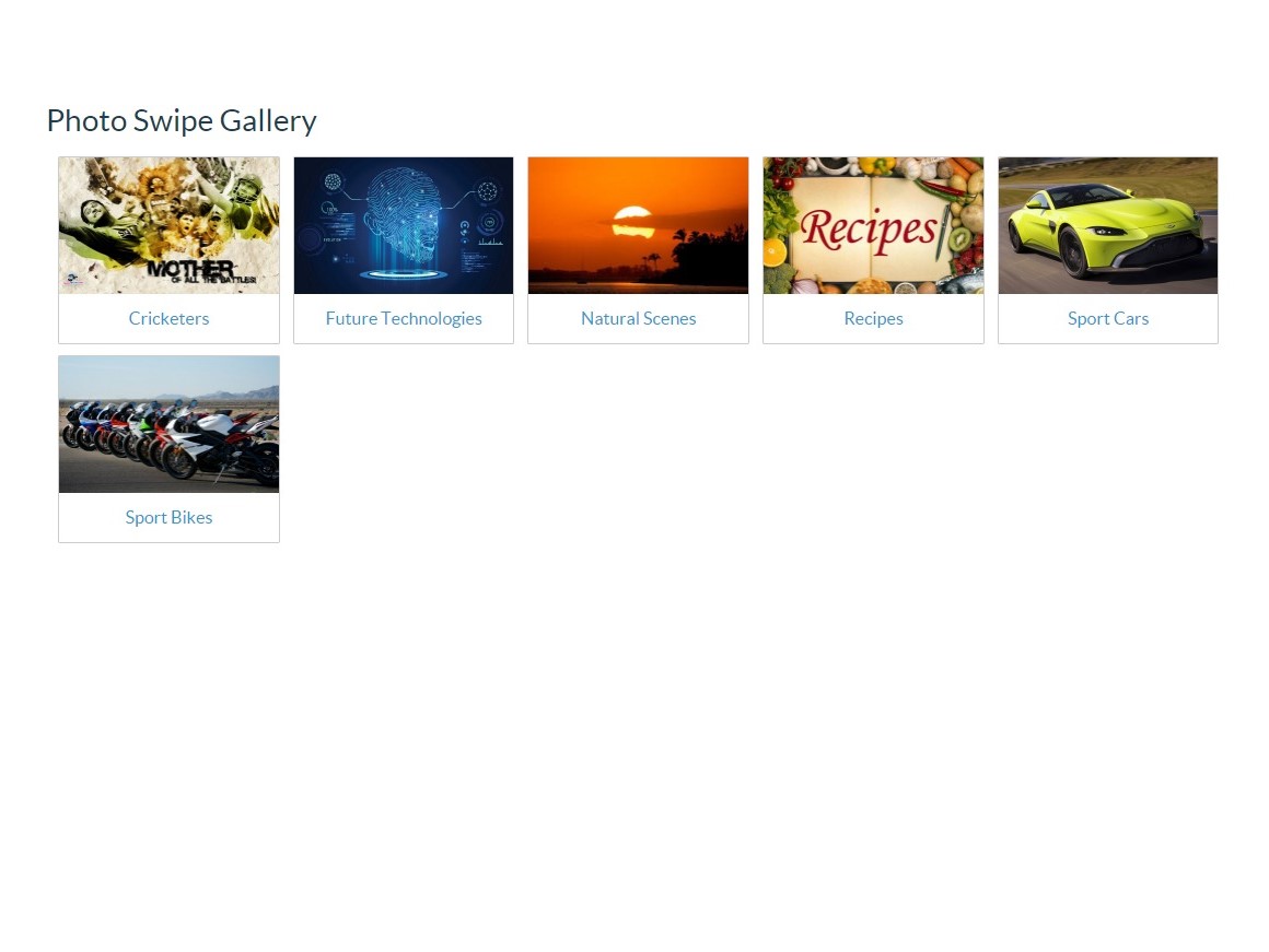
1.) Album List
2.) Gallery
3.) Images of Gallery
To include Album component on your page:
- Click on CMS in Backend.
- Select page you want to include this plugin.
- Click Components and select component from Photo Swipe plugin Album and drag it to the desired position or simple Click on View Gallery and write
{% component ‘albums’ %}where you want to place Albums.
Same process for other components: Gallery (
{% component ‘viewGallery’ %}) & Images of Gallery ({% component ‘directGallery’ %}).
Configuration:
In your layout file, you have to write {% placeholder photoswipe %} in the body section.
Important note: This is very important to initialize the PhotoSwipe Gallery. If you forget to implement this, it will not work. And make sure you have added JQuery script in your layout or page.
Different components have different properties as per below:
-
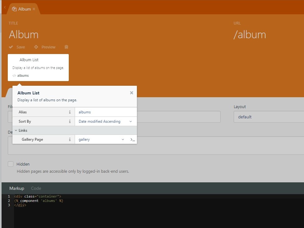
Album List component
-
Sort By: You can sort your albums on frontend by Title, Date modified and Published On with desirable Sort By property.
-
Gallery Page: In Links tab of properties, you have to select gallery page from dropdown to give link to the albums.
-
Important Note: Your gallery page should have
:slugin URL
Here is the example of Album List component implemented on the page
    title = "Album"
    url = "/album"
    layout = "default"
    is_hidden = 0

    [albums]
    sortBy = "updated_at-asc"
    galleryPage = "gallery"
    ==
    <div class="container">
    {% component 'albums' %}
    </div>
-
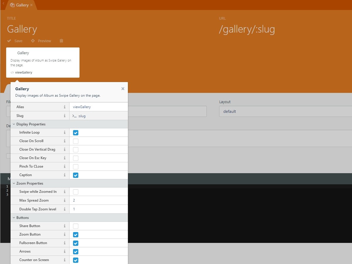
Gallery component
-
Slug: To show specific gallery, Enter the slug of the gallery. (Note: If you want to show gallery with album links, Please do not change its default value(
:slug)) -
Display Properties: Here you get flexible display properties.
-
Infinite Loop: If set to true you'll be able to swipe from the last image to first image. (default value:
true) -
Close On Scroll: If set to true on mouse scroll, gallery will be closed. (default value:
false) -
Close on Vertical Drag: If set to true, gallery will be closed on dragging vertically. (default value:
false) -
Close On Esc Key: If set to true on Esc Key press, gallery will be closed. (default value:
false) -
Pinch To Close: If set to true, the gallery’s background will gradually fade out as the gesture is complete, the gallery will close. (default value:
false) -
Caption: If set to true, Caption will be displayed below the image. (default value:
true)
-
-
Zoom Properties:
-
Swipe while Zoomed In: If set to true, It allows swipe navigation to next/prev item when current item is zoomed. (default value:
true) (Note: Option is always false on devices that don't have hardware touch support.) -
Max Spread Zoom: It is an integer value that will define maximum zoom level when performing spread(zoom) gesture. (default value:
2) -
Double Tap Zoom Level: It is an integer value that will define zoom level to which image will be zoomed after double-tap gesture, or when the user clicks on zoom icon, or mouse-click on the image itself. (default value:
1)
-
-
Buttons: You can change availability of different buttons.
Button If set to true Default value Share Button It will display share button. false Zoom Button It will show zoom button. true Fullscreen Button It will display fullscreen button. true Arrows Button It will show next/prev arrows. true Counter on Screen Button It will display counter(e.g. 1/5 ) on gallery. true
-
Important Note: Your gallery page URL should contain
:sluglike Example's URL/gallery/:slug.
Here is example of **Gallery** component implemented page:

    title = "Gallery"
    url = "/gallery/:slug"
    layout = "default"
    is_hidden = 0

    [viewGallery]
    slug = "{{ :slug }}"
    loop = 1
    closeOnScroll = 0
    closeOnVerticalDrag = 0
    escKey = 0
    pinchToClose = 0
    captionEl = 1
    swipeWhileZoom = 0
    maxSpreadZoom = 2
    getDoubleTapZoom = 1
    shareEl = 0
    zoomEl = 1
    fullscreenEl = 1
    arrowEl = 1
    counterEl = 1
    ==
    {% component 'viewGallery' %}
-
Images of Gallery component
- Gallery: It is dropdown of published galleries. Select the gallery you want to display images of it on the page.
Other Properties are same as Gallery Component.
-
CSS Support:
-
If you want to change the size of the thumbnails of images, you can do by placing this class in your CSS
.photo-swipe-gallery figure { //particularlly you should adjust only width e.g. width: 269px; } -
If you want to change the area of the albums, you can do by inserting this class in your CSS
.responsive {
    //define only width e.g. width: 18%;
}
-
Note: If you have good skill on CSS then you can customize custom.css file (path: plugins/chiragpatel/photoswipe/assets/resources/custom.css).
-

Kevin
Found the plugin useful on 12 May, 2018
Hey! On your getimagesize functions, you might want to change $image->getPath() to $image->getLocalPath(), it will make the function much faster.
-

Chirag Patel author
Replied on 16 May, 2018
Sure, I will change it in next update. Thanks for the review :)
-


| 1.0.2 |
Created table chiragpatel_photoswipe_galleries Apr 04, 2018 |
|---|---|
| 1.0.1 |
Initialize plugin. Apr 04, 2018 |